The scope and sweep of global change can be overwhelming. We are driving the Earth’s weather/climate machine into uncharted territory through greenhouse gas emissions, land use change and ever increasing human numbers. Individual stories about changing global temperatures, loss of Arctic Sea ice, the state of El Niño, or the ozone hole, can make it difficult to put them all in perspective or see how they might be related.
A recurring theme in this Substack site has been presenting the amazing array of technologies that allow us to “see” how our world is changing. Satellites measuring light visible to us record altered land use. Other sensors make visible to us things we can’t see directly, like the hole in the ozone layer over Antarctica. Combining sensors with monumental data sets yields summary images of change in fundamental climate variables like global temperature. The importance of these long-term, high-quality data sets and images for understanding and monitoring global change cannot be overestimated.
And while data and numbers are the language of science, images can be so much more powerful than either numbers or words in capturing and communicating what those numbers represent. In my previous essay on visualizing the dynamic distribution of carbon dioxide in the atmosphere, learned scholars were cited as saying that a picture is worth much more than a thousand words. Some put that equivalence at more than a million.
If so, I am about to introduce you (unless you have already been there) to a multi-billion-word tour of the Earth covering both natural processes and how we are changing our home planet, all captured in a single website.
NASA is the long-term keeper of the images of our living planet and, along with NOAA, EPA and international collaborators, of many of the data sets that chart our past and predict our future. I am always cruising these sites looking for new information to better understand and present our global environmental trajectory, but have only recently become aware of the World of Change site, part of NASA’s Earth Observatory.
The main page on this site contains images and links to a number of global change topics. If you pick one, you will usually get a visual tour of changes of that part of the Earth system over time presented as a series of satellite-acquired remote sensing images and compiled global data sets. To the right of the page on which you land there will be a long list of links to similarly image-rich pages capturing many different aspects of our changing planet.
The format for most of these is a running slide show, if you like, of compiled images capturing change over time. Beyond the 32 topics (currently) in the list down the right-hand side of your page, there are boxes at the bottom that launch you into a curated set of stories on a topical theme (Land, Water, Human Presence). The choices will differ depending on the main topic on your current page. Using our million-word analogy, the 12,900 images currently on this site gets us nearly 12 billion words worth of information!
This is something like an indexed and cross-referenced visual encyclopedia of the dynamics of the Earth – like a visual Wikipedia. The range of topics allows some comparisons among trends that have some explanatory power. There are two examples below.
In this essay format, I can’t even begin provide details of the changes captured in the images on this NASA site, not even for the small subset of topics presented below. In fact, NASA writers have provided explanations of a nearly uniform length (10-20 paragraphs) on every page that draw on and give attribution to a wide range of colleagues and institutions. These can guide you several steps deeper into an understanding of each event or image.
So what follows is really a very partial thumbnail-scale introduction to the wide range of topics covered on NASA’s Earth Observatory site, and really just to those gathered under The World of Change project. Hopefully you will get lost in the site itself and emerge increasingly intrigued with how the Earth System works, and feeling better informed as well.
I’ve embedded here just one or two images from the full sequence for each of the topics presented.
Let’s start with a totally natural event and then move through a series of changes wrought indirectly, and finally directly, by human activity.
Mount. St. Helens in the Cascade Range of southern Washington state, erupted dramatically in May of 1980. The resulting local devastation was extreme, but also provided the opportunity for long-term studies of natural revegetation and ecosystem development on a raw geologic substrate. In 1982, 110,000 acres surrounding the mountain was declared a national monument. Monitoring of ecological recovery has been continuous ever since and was summarized in a book published in 2018.
In these images from 1980 and 2016 the devastated area resulting from the eruption (the gray area in the 1980 image – vegetation there recorded as red) has been slowly re-invaded by plants (green in the 2016 image) especially on the north side of area.
Yellowstone - In 1988, nearly one third of Yellowstone National Park was consumed by fire. Controversy has surrounded this event as it was a naturally occurring fire in an area in which decades of fire suppression had resulted in an unnatural accumulation of live and dead biomass, enhancing the burn. It was also a first in that a natural fire was allowed to burn for some time instead of being suppressed immediately. The first image is from 1989 and the burned areas are in red. The second image, from 2019, shows some regrowth, especially in the northern reaches of the park but as this is a relatively dry environment, decades more will be required for full recovery. While it was thought that visitations would be much lower after the fire, record numbers of visitors came to see the impact.
California Drought - Episodic drought is common in California, but the prolonged dry spell of 2013-2015 was a record breaker. The region is heavily dependent on snowmelt from the Sierra Nevada range to provide water for residential and agricultural use during the long, dry summers. These images compare near-normal snow cover in late march of 2011 with the same time period in 2015. So far, 2021/22 has been a good year for snow in the Sierras. You can get real time data on this from the California Data Exchange Center.
El Niño (or ENSO) is a recurring change in the pattern of ocean currents and atmospheric circulation in the equatorial Pacific Ocean that affects climate in many parts of the world. During an El Niño event, sea surface temperatures increase by as much as 6 degrees Celsius and significant changes in the distribution of rainfall occur. This image captures the very strong El Niño of 1997/8 and resulting rainfall changes.
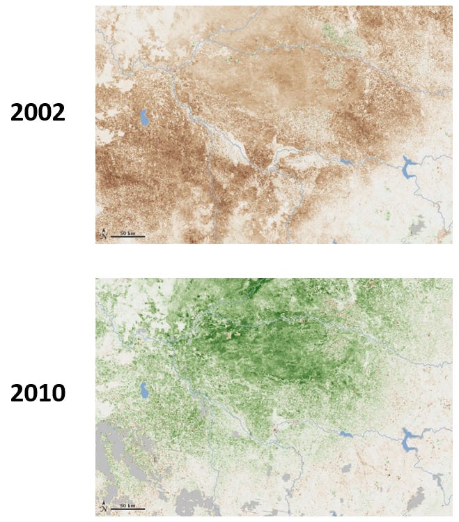
Increased rainfall in the central Pacific, and especially in coastal Peru during an El Niño event means less rain, drought, and an increase in fire frequency and intensity in Australia. The images below, from southeastern Australia, capture the difference in amount of green vegetation between an El Niño year (2002) and a La Niña year (2010) when Pacific Ocean temperatures would be below average and rainfall in Australia would exceed normal amounts. Data on the status of the El Niño oscillation can be found here.
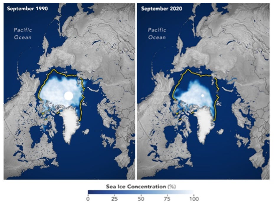
Arctic ice loss and Temperatures - One of the most dramatic series of images in the NASA repertoire is the loss of summer sea ice extent in the Arctic Ocean over the last 30 years. Projecting these changes into the future suggests that summer sea ice will completely disappear around 2075.
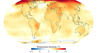
This dynamic change relates directly to the uneven distribution of temperature increases since 1880, being much larger in the Arctic than the global average.
Ozone hole and CFCs - In the 1970s, a team of soon-to-be-Nobel prize winners described how concentrations of chlorofluorocarbons (CFCs), a totally man-made class of chemicals, could reduce the concentration of ozone in the upper atmosphere (stratosphere) over Antarctica. Ozone in the upper atmosphere absorbs most of the potentially damaging ultraviolet radiation received from the sun. A NASA satellite system began monitoring ozone concentrations over the South Pole at about the same time, with the resulting images from 1979 and 2006.
International action through what has become known as the Montreal Protocol banned the production of CFCs in 1989, but as CFCs are inert in the lower atmosphere and take some time to reach the ozone layer, reductions in the size of “hole” have been slow. Still, ozone concentrations in this layer have been increasing slowly since the lowest levels were recorded in 2006.
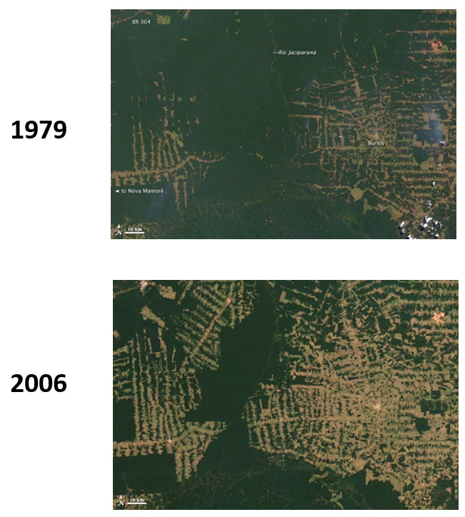
Deforestation - The Brazilian state of Rondonia has been a focal point for monitoring the pace of deforestation in the Amazon for decades. Changes in Brazilian national policy have alternately encouraged or discouraged settlement and forest clearing in the region. These images show the “finger” pattern of settlement from 2000 to 2014 resulting from road building and land grants in the region.
A federal program introduced in 2004 to reduce annual rates of deforestation by 80% by 2020 was on track until 2016, when rates began to increase again.
The Aral Sea in central Asia, between Kazakhstan and Uzbekistan, was once the fourth largest in the world. In the 1960s, the then-Soviet Union diverted the rivers flowing into this sea to support agriculture in this arid region. The result has been the near-total disappearance of the Aral.
The first image here from 2000 shows that the area of the Aral was already reduced by more than half (note the light yellow line marking the original extent). The second image, from 2018, shows that a dam project to isolate the part of the sea at the left has both continued the existence of that small portion, and hastened the disappearance of the rest.
* * * * * * * * * * * * * * * * * *
All of the images and much of the information on the topics presented here can be reached from that one NASA World of Change page. This is truly a unique resource and it can be fun and informative to wander through it. It is sobering as well to realize, as you wander, the substantial and directional impact we have had on just about every part of the Earth system.


