

Celebrating Autumn
Poetry and Science: Different ways to experience this season that touches both the heart and the mind

Autumn is special for many. Maybe I feel a little more strongly about the season for having grown up without it. In Los Angeles, September and October can bring some of the hottest days, and in my childhood also brought some of the worst air pollution events.
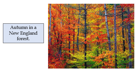
But enough of that. I live in New England now where autumn is a glorious if brief time of vivid colors in the woods and the abundance of harvest days at local farms. Autumn is a special season in most places, and can be celebrated in many different ways, these are just my favorites.
I also enjoy revisiting the poetry of Robert Frost in this season. He captures my own encounters with the natural world in ways that are hard for this literal-minded scientist to express.
From being tired of apple picking, to following one of two paths in a yellow wood, to lamenting that "nothing gold can stay" (actually about spring, but allow some poetic license here), his words have always stirred an irrational longing and melancholy, as well as joy. I have also experienced stopping by woods on a snowy evening, as well as having a crow shake down on me a dust of snow from a hemlock tree.
Carefully crafted words celebrating the deep beauty and natural rhythms of the place and seasons, as well as the ephemeral nature of both.
Last year at this time, I was also sidetracked by the wonders of autumn, and took a thought path through the woods that led to writing about trees as crafty green strategists that optimize leaf longevity and carbon gain under different conditions. To be poetic, those trees selfishly and calculatingly and thoughtlessly discard those bright green helpers that have captured sunlight for them all summer just as soon as they fail to do so. Not only are those leaves casually tossed aside, they are also mined for essential nutrients, like nitrogen, before being discarded, so those selfish trees can thrive again next year.
You know, it is really fun to write like that, without a care for scientific accuracy or trying to avoid the allure of human analogies! I can't remember the last time I used that many adverbs in a paragraph. One of my first graduate students had been an English major as an undergraduate and wrote beautiful prose. It was hard and sad to edit her thesis as a science editor would. No adjectives, no introductory phrases, just "we did this" and "here is what we found."
And as this is a site about science, I'll shift now from my poor attempt to capture the power of words alone to using words to help present the images and numbers that are the language of science. If I can just avoid being sidetracked by those colorful leaves outside my window….
So, how do we chart the seasons in graphs and numbers, and how are the seasons changing as the planet warms? There are lots of metrics, and many of them will be familiar to anyone who gardens or plans travel times. They all reinforce the same trend, and perhaps none of them will surprise you (See the Sources section at the end for citations).
The most traditional way to clock the ecological impacts of the change in seasons is using long-term weather data to determine the average day of last frost in the spring and first frost in the autumn.
The USEPA has summarized changes in these two metrics since 1890. Nation-wide, last spring frosts were much later in the early 1900s, became earlier through the warm period of the dust bowl in the 1930s, and recovered some through the 1960s before becoming dramatically earlier through 2020. First fall frost shows a complementary pattern, now averaging about 11 days later, nationwide, than in the 1890s.
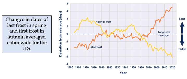
Another way of viewing the same information is to calculate the length of the growing season, or the number of days between the last spring and first fall frost.
Here is how length of growing season has changed nationwide from 1895 to 2020. For New Hampshire, the last frost in spring comes about 10 days earlier, and the first frost of fall is about 15 days later, so the growing season is about 25 days longer. Even in this state that is ~80% forested, sustainable and farm to table agriculture are booming.

Other pages on that same EPA site chart changes in heating degree days (decreasing) and cooling degree days (increasing). Your heating bill should be dropping (well, probably not this year!) while your air conditioning bill (a new concept in New Hampshire) may be increasing.
Another commonly used metric of regional differences in climate is USDA's map of plant hardiness zones. Unlike the maps above, this charts the lowest temperature to be expected across an entire winter season. This matters because different plant species, both agricultural and horticultural, have very different tolerances for extreme cold.
The original map shows trends from south to north that you would expect. The change map shows how these zones are expected to shift north by the end of the century.

That figure on the right is for a relatively cool future scenario. Hotter scenarios produced by different climate models predict as much as a 3 full zone change for some locations across the northeast. This map also reinforces what we have already seen, and is predicted to continue into the future, that the rate of warming is and will be greater the farther north you go.
At a finer scale, maps for the lake states show both how zones have already shifted (and this only from 1990 to 2006) and how much more they would be expected to move by 2090 under some older high and low greenhouse gas emission scenarios. Central Iowa, for example, was in zone 5 in 1990, and might be in zone 7 by 2090.

This essay began with the drama of leaf color and fall in the autumn. We would expect that changes in weather and climate, as captured in these maps, might influence when leaf fall occurs, but are there direct measurements that can tell us if the season is now happening later? There are.
Some long-term ecological research sites have collected visual data on the timing of leaf out and leaf fall for a couple of decades. Researchers return to specific locations in their study sites and note when either leaf development in the spring or loss in the fall has reached a certain stage. For two sites, the long-term trends follow what the climate numbers would predict: Leaves are coming out sooner in the year and dropping later.
At the Harvard Forest in central Massachusetts, spring arrived about 10 days earlier in 2011 than in 1990, and fall happened about 15 days later. At the Hubbard Brook Experimental Forest in New Hampshire, phenology has been linked to temperature, showing both an earlier spring and a later fall.

Long-term numbers like these for two sites capture a trend, but how might that vary across a continent? The National Phenology Network (NPN), now managed by the US Geological Survey, began as a citizen science project where a single clone of lilac or honeysuckle was sent to volunteers who planted them and then recorded each year the timing of different phenological stages (bud break, flowering, leaf drop, etc.). At this point, available images on the site emphasize current stage of development and compare, for example, how often spring has arrived this early.
Methods that rely on human observations can be hard to standardize across a network like NPN - they can be subject to human errors and interpretations. Surely there are more technologically advanced ways of assessing plant and ecosystem phenology.
Here are two: phenocams and remote sensing.
The PhenoCam network was established in 2008. To join the network, researchers at existing study sites mount a small camera at an appropriate height and view angle. The camera collects digital images of visible light in the red, green and blue parts of the spectrum. The images can be used to estimate the amount and condition of leaves in a canopy, among other indicators, at the time of observation. This network has grown to over 600 sites encompassing a full range of ecosystem types.
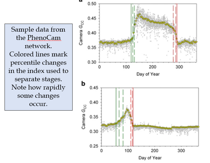
Data received from cameras are processed into a standardized index which can then be plotted over time for different locations and systems. This figure gives an idea of how frequently and consistently data can be collected, and how timing of seasons and stages can be standardized. Images of different camera setups in different ecosystems can be seen here.
It takes more than 14 years of data to discern a trend, but PhenoCam is perfectly poised to detect those trends as the data sets accumulate over time.
Satellite remote sensing would seem to be the perfect tool for charting changes in phenology at the continental scale. The primary characteristics of satellite sensors (spatial resolution, return time for one site, and wavelengths sampled) have all improved over time. The complexity of these systems can't be captured in this essay, but NASA has a training site on phenology if you want to dive deeper (See Sources below). There is also a recent study that compares the different satellite methods using PhenoCam results as the "true value" against which the satellites are measured.
Until recently, resolution in time and space have limited the ability of remote sensing instruments to detect rapid changes in phenology, but it seems there is a revolution afoot in our ability to monitor the state of the Earth from space. While previous satellite efforts have involved one or a few large complex instruments, two different efforts are taking the opposite approach. Both use a "flock" of very small, lightweight, single purpose instruments, called Doves, that can tag along on rockets launching larger instruments. Doves can weigh less than 10 pounds and have cameras sampling up to 8 regions of visible and infrared light reflected from Earth's surface. The two projects using Doves are organized by the European Space Agency (called PlanetScope), and by a private company in the U.S. called Planet Labs.
The advantage of Doves is that they are relatively inexpensive so that hundreds can, and have, been launched. The flock generates huge amounts of data each day and requires sophisticated analyses to integrate the information obtained from all the Doves to generate images. A very recent paper has presented the results of an effort to combine PhenoCam and PlanetScope data to generate very high resolution images of phenological change over very short time periods.
Can't wait to have 30 years of that kind of data!
There is one more method for capturing the impact of changing seasons on plants, and that is to measure when carbon gain, or photosynthesis begins and ends - a measure of the physiology or function of that leafy canopy.
An excellent record of changes in this physiological season also comes from the Harvard Forest where carbon gain and loss have been measured continuously since 1992 by a method called eddy covariance. Results show that increases in the length of growing season reported above for that site translate to increased carbon gain in the spring and fall which play at least some part in a continuously increasing rate of carbon gain over time.
National maps and graphs of trends can register change intellectually, but local events can help bring that message home. So here is one based on a tree on my campus at the University of New Hampshire. There is a ginkgo tree in front of James Hall, the building that houses several environmental programs. It is a peculiar trait of this species that it tends to drop most of its leaves on a single day. Starting in 1977, one department began a pool to guess on what day the ginkgo would shed its leaves.
That office pool continued for many years, and with the changing of the times, a new emphasis on global change, and careful sleuthing by Professor Serita Frey, became a climate change data set. The date of leaf fall shows an average rate of change of 3 days per decade from 1977 to 2017.

So, we have ventured in this essay from a scientist's poor attempt to relate to the poetry of autumn into deeply complex methods for measuring how the season is changing. There are indeed many different ways to experience autumn. I hope one speaks to you, and helps you capture some joy or meaning in the beauty of the season. But don't wait - "nothing gold can stay."
Sources
The graph of changes in first and last frost and the map of change in length of growing season are from:
https://www.epa.gov/climate-indicators/climate-change-indicators-length-growing-season
Information on change in heating and cooling degree days is from:
https://www.epa.gov/climate-indicators/climate-change-indicators-heating-and-cooling-degree-days
USDA's maps on plant hardiness zones and expected changes are from:
https://planthardiness.ars.usda.gov/
https://www.fs.usda.gov/rmrs/science-spotlights/visualization-future
And the maps for the lake states are from:
https://nca2009.globalchange.gov/observed-and-projected-changes-plant-hardiness-zones/index.html
Additional data showing faster rates of change in climate with increasing latitude is here:
https://www.nature.com/articles/s41598-018-22258-0#
Data on direct observations of phenology at the Harvard Forest and Hubbard Brook can be found here:
https://harvardforest.fas.harvard.edu/sites/default/files/LTER_VI_Combined_forweb.pdf
https://hubbardbrook.org/online-book-chapter/forest-physiology-and-phenology/
Sites using NPN data include:
https://www.usgs.gov/news/featured-story/just-how-early-spring-arriving-your-neighborhood-find-out-0
https://www.usgs.gov/media/images/spring-leaf-out-over-years
https://www.usanpn.org/news/spring
The PhenoCam figure is from:
https://www.nature.com/articles/sdata201828
and is used here under the conditions described in the Creative Commons Attribution 4.0 International License.
The NASA training site for using remote sensing to study phenology is here:
https://appliedsciences.nasa.gov/sites/default/files/2021-01/Phenology_Session3_Final.pdf
And the paper comparing different remote sensing methods with PhenoCam results is here:
https://bg.copernicus.org/articles/18/1971/2021/
A full review of carbon balances at the Harvard Forest is here:
https://esajournals.onlinelibrary.wiley.com/doi/10.1002/ecm.1423
An article on the University of New Hampshire gingko tree phenology is here:
photo and data courtesy of Dr. Serita Frey.