An updated version of this essay can be found here
Today marks the six month anniversary of the beginning of this series of essays on weather, climate and climate change. To celebrate, I am reposting the first two essays in this series which hopefully set the tone for accessible and interesting stories about the science (not the politics or policy) of climate. As many readers have joined the site since May, these two essays may not have been visible to many of you. I hope you find them enjoyable and informative. The regular bi-weekly posting (forests and global carbon) will follow on Monday.
Climate Change in Four Easy Steps - We have known some of this for a long time
You may have seen the cartoons of the two lab-coated scientists standing in front of a white board. On both the left and right side of the board are a series of complicated equations, and between them a blank space with just the phrase - and then a miracle occurs. One scientist says to the other – Maybe you should be a little more explicit here – or words to that effect.
That cartoon was often in the back of my mind when trying to present climate science to new students or general audiences. We have solid measurements that show we are changing the chemistry of the atmosphere, and that the climate is warming, but linking the two, traditionally, has required reference to the hugely complex computer models that have been constructed for that purpose. When you see predictions for the future, models again take center stage.
Those models represent the state of the art in terms of climate science, but they are opaque to all but the most deeply involved, and can obscure what are some relatively simple and straightforward relationships that are apparent in reported measurements alone. We do not need to resort to the complex models to make the major points about climate change. We can do it here in four easy steps.
The first two are drawn from questions I use to begin presentations to those new students or general audiences:
1. When did we learn that carbon dioxide can act as a greenhouse gas by absorbing long-wave, or infrared, or “heat” radiation?
2. In what year was the first calculation made by a Nobel-laureate scientist of the impact of a doubling of carbon dioxide in the atmosphere on global temperature?
The answers are 1) around 1860, and 2) 1896 or 1908, depending on which publication you want to cite.
With this background, we should not be surprised that a simple comparison of long-term measurements of carbon dioxide concentration in the atmosphere (step 3) with recorded changes in global temperatures show a convincingly strong relationship (step 4), and indicate where we are headed.
The whole, rich story can’t be told in this essay format, but what follows is an outline of those four major steps.
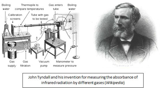
John Tyndall was a prominent Irish physicist with interest, among other things, in infrared radiation, the part of the spectrum of light beyond what we see as red that transmits heat as radiant energy. You can feel this form of energy if you sit in front of a heated wood stove. You can “see” this energy with some night vision binoculars, and note the outline of warm-blooded animials, like us, as we radiate more in the infrared than inanimate backgrounds. In the 1850s, Tyndall invented a method for measuring the ability of different gases to absorb this form of energy, and determined that carbon dioxide, methane, and especially water vapor, were very efficient at this process. Knowing that these gases occur in the Earth’s atmosphere, he speculated that the Earth would be much colder than it is, were they absent.
Svante Arrhenius was awarded one of the first Nobel prizes in chemistry in 1903. At a volatile time in his life, and knowing about both Tyndall’s work and the recently accepted concept of ice ages, Arrhenius spent most of a year doing perhaps as many as 100,000 hand calculations to predict the impact of carbon dioxide on global temperatures. His goal was to see if reductions in carbon dioxide concentrations could have triggered an ice age.
His summary equation, published in Worlds in the Making in 1908 summarized a year’s worth of calculations in a simple relationship with one variable, the concentration of carbon dioxide, and a single factor relating this to global temperature. He predicted that a doubling of carbon dioxide in the atmosphere would lead to a 4 degree Celsius (~7 degree Fahrenheit) increase. Modern estimates of this carbon dioxide sensitivity of the climate system range from 2 to 5 degrees Celsius. He also predicted, accurately, that temperature increases would be greater at the poles than the equator, and knew that the oceans take up a significant amount of emitted carbon dioxide. Both of these facts are reflected in modern models of the climate system.
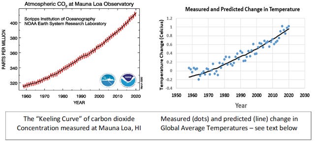
For the third step we need to bring in Charles Keeling. In the 1950s, Keeling improved the accuracy of methods for measuring carbon dioxide in the atmosphere and pulled together the resources to establish a laboratory atop Mauna Loa on the big island of Hawaii to make continuous measurements of this gas. The measurements have continued to this day. I present the graph on the left below to general audiences as the climate change icon of our day, and am always surprised by how few people have seen it! While precise enough to capture the annual cycle of the metabolism of the Northern Hemisphere in the seesaw pattern, the more important pattern is the continual increase in concentration over the last nearly 60 years. Samples from ice cores tell us that the concentration of carbon dioxide in the atmosphere has never been above 300 parts per million over the last 800,000 years. We are now consistently above 400 parts per million. This increase is due almost entirely to the burning of fossil fuels.
The fourth and final step I owe to the students in my Environmental Science class. Having presented Arrhenius’ simple equation (it’s included in the Sources section below) and the Keeling curve, it seemed like a natural thing to put those together with the measured changes in global temperature compiled by the Goddard Institute for Space Science (GISS) and ask the students to use a simple spreadsheet program to test for a relationship. The results (graph on the right above) were amazing to me. Not only was the relationship very tight, but it was so precise that the “errors” in the prediction could be further reduced by adding in an index of the El Nino phenomenon, known to affect global temperatures (The blue dots are from the GISS data set, and the black line traces the predictions made using the simple Arrhenius equation and measured concentrations of carbon dioxide at Mauna Loa - see Sources below for a more complete explanation of how this figure was derived).
And as a final step not shown here (more on this in a later essay), if you add predictions for future changes in both carbon dioxide and temperature from the latest version of the models of the Intergovernmental Panel on Climate Change (IPCC), this same relationship still holds. This means that both the direct measurements, and the dynamics of the climate system captured in those models, support this straightforward presentation.
So the bottom line here is this:
1) We’ve know that carbon dioxide is a greenhouse gas since about 1860.
2) The first calculation of the impact of carbon dioxide on global temperatures was completed in 1896. Later and more complex methods give values in the same range calculated by Arrhenius.
3) We have a very precise record of increases in carbon dioxide in the atmosphere and know that this has been caused mainly by burning of fossil fuels
4) There is a very strong relationship between carbon dioxide in the atmosphere and global temperature.
What does this simple story tell us about our future? The biggest uncertainty with regard to global average temperature is not in our understanding of the interactions of greenhouse gases and climate, it is uncertainty as to future greenhouse gas emissions. A final summary diagram out of the last report of the IPCC follows the same logic offered here. That diagram draws a direct relationship between cumulative carbon dioxide emissions and global temperature. As a relatively constant fraction of emitted carbon dioxide remains in the atmosphere (most of the rest being dissolved in the oceans, as Arrhenius knew in 1896), this is roughly equivalent to the relationship in my classroom graph above.
It is important to note that carbon dioxide is not the only greenhouse gas, just the most important one. The strong relationship presented here also says that this gas is a powerful INDEX to the other changes that are happening to the chemistry of the atmosphere. There are good reasons why this should be so, and good data that support those reasons, but that is for another essay.
The purpose of this Substack site is to present the basics of weather, climate, and climate change in the simplest and most accessible way – hopefully generating more light and less heat. A rational discussion of our climate future requires some basic agreements about the science. The full story from Tyndall through Arrhenius to Keeling and the IPCC is a rich one and deserves a fuller telling, but the basics here are accurate, and I hope logical and compelling.
Sources:
Wikipedia pages related to this essay include:
John Tyndall (the physicist!)
Svante Arrhenius
Keeling Curve
Carbon Dioxide in Earth’s Atmosphere
IPCC
Note: I will refer to Wikipedia articles frequently in these essays. While the user needs to be careful about rogue edits that occasionally appear, this online encyclopedia is generally an incredibly useful source for basic information on a wide variety of subjects.
The full IPCC website is at www.ipcc.ch
And the graph of cumulative carbon dioxide emissions and global temperature is currently at:
https://ar5-syr.ipcc.ch/topic_futurechanges.php)
An excellent source on the life of Svante Arrhenius is Elisabeth Crawford’s Arrhenius: From Ionic Theory to the Greenhouse Effect, Science History Publications, Canton, MA, USA. 1996. 320pp.
Data for the “Keeling Curve” are available at:
https://keelingcurve.ucsd.edu/
Global average temperature data from the Goddard Institute for Space Studies can be found here:
https://data.giss.nasa.gov/
The equation used to predict changes in temperature as a function of carbon dioxide comes directly from Arrhenius and has the form:
Change in temperature = a * ln(C/Co)
Where C is the current concentration of carbon dioxide, Co is the initial concentration (starting at the pre-industrial level of 278 parts per million), “ln” is the natural log function that makes the relationship non-linear, and “a” or alpha is a statistically derived coefficient. With alpha equal to 4.05, the average difference between the measured data and the value predicted by this equation (shown as the solid line in the graph) is about 0.08 degrees. Adding the El Nino factor reduces that average to about 0.06 degrees (line not shown, more in a future essay on this). All values are in degrees Celsius (or Centigrade).


