Quantitative Reasoning with Climate Data
Linking carbon dioxide and temperature using a 114-year old equation
It seemed kind of risky to bring “quantitative reasoning” into these essays – to rely directly on numbers, graphs and statistical relationships to provide simpler explanations of weather and climate. The first paragraph below explains the risk. To my great surprise, this first essay taking that approach was one of the most frequently read! I think it is being used in classrooms as a simple spreadsheet lab exercise. I have enjoyed using it in class myself to introduce both Svante Arrhenius and the long history of our understanding of greenhouse gases and climate.
With Scott Ollinger
Equations Are the Language of Science – Numbers Are the Alphabet
Numbers - some people like them, some really don't! Even in my introductory environmental science classes, where a predilection for numbers might be assumed, some students would enjoy working with numbers, and some wouldn't.
But numbers and equations are the language of science, and graphs are the pictograms. So, what I tried to do with my novice scientists to enhance their ability and enjoyment in working with numbers, was to use what curricular folks like to call "quantitative reasoning." Start with a question, look for visible relationships in the available data, and then see what math tools are available to bring you to an answer. For the example presented here, we'll use some of the most essential climate change data.
The first essay posted to this site presented the basics of climate change science in Four Easy Steps. The fourth and final step was using numbers on measured changes in the carbon dioxide concentration in the atmosphere and global average temperature to test a simple equation derived from the work of Svante Arrhenius in 1896 (again emphasizing how long we have known some of the basics about climate change!).
Requests from some readers for a more complete description of that fourth step led to the following attempt to demonstrate quantitative reasoning while also diving deeper into what the equation derived from Arrhenius’ 1896 calculations might tell us, given modern data.
The Numbers
Here are the numbers we'll use, in graphic form:
Both of these data sets are rigorously reviewed, updated continuously and published openly. We owe a great deal to those dedicated scientists and technicians who maintain these vital records! It is always surprising to me how few people are familiar with the "Keeling Curve" of carbon dioxide concentrations on the right. I think of it as the environmental icon of our time.
Arrhenius did not have access to numbers like these but was aware of the work of John Tyndall who, in the 1850s, first measured the absorption of infrared radiation by carbon dioxide that defines it as a greenhouse gas. Arrhenius used this understanding in an effort to determine whether the then recently-discovered ice ages could have been caused by a reduction in carbon dioxide in the atmosphere. He spent a full year carrying out tens of thousands of hand calculations testing this idea. He did not discover the cause of the ice ages, but he did derive another iconic relationship in climate science.
The Relationship
In a book intended for general audiences and published in 1908, Arrhenius summarized his results by saying that a doubling of carbon dioxide in the atmosphere would increase global temperatures by 4 degrees Celsius, and that the relationship between the two was not linear. Later researchers have summarized this relationship with this equation:
Translating this into words, delta F is change in temperature (actually “radiative forcing” but we will use temperature in degrees Celsius here), C is current carbon dioxide concentration, Co is initial concentration, and alpha (a) is the single parameter that links the two. The "ln" function is the natural logarithm which makes the relationship curved (non-linear).
For this quantitative reasoning exercise, my students were given a spreadsheet (pictured below) that had one column for the carbon dioxide values from the Keeling Curve (Mauna Loa) and one for the temperature change values (GISS). In that spreadsheet, C/Co is the measured carbon dioxide number divided by the pre-industrial carbon dioxide value of 278 parts per million (ppm). The "Start at" number accounts for the amount of temperature increase that had already occurred before 1958, when the Mauna Loa carbon dioxide measurements began. All temperature change values (GISS) are in hundredths of a degree Celsius.
The "Arrhenius Predicted" column uses his equation above with the C/Co number for that row and the alpha number (a =) to predict temperature change. The Residual is the difference between that predicted number and the measured GISS number (in hundredths of a degree Celsius). The Absolute Value column is Residual expressed as a positive number - the "distance" between the GISS data and the Arrhenius prediction. The Standard Error of the Estimate is the average of all 64 absolute values.
As the value for alpha is changed in the spreadsheet, the values for predicted temperature and the residual change automatically, causing the standard error to change as well. Using an approach that a statistician might call an "iterative least squares" method, the students had to derive the best value for alpha by minimizing the Standard Error of the Estimate.
The Results
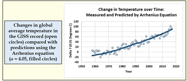
This worked well as an intuitive introduction to statistics, but what was surprising to us all (and to colleagues who have seen the results) is just how well this simple equation predicts changes in global temperatures. Remember that the equation is derived from results published in 1908! The best value for alpha (4.05) yields an average difference between the measured and predicted values of .081 degrees Celsius (8.1 one-hundredths of a degree – the SEE number in the figure above).
Here is what that looks like graphically:
Here is another surprise. With the alpha value derived from these data sets (4.05), the estimated increase in temperature for a doubling of carbon dioxide would be 2.8 degrees. Over a century ago, Arrhenius, with his estimate of 4 degrees, was only off by a little over 1 degree!
Two surprises down, but an even bigger one followed. Spencer Weart has noted that the state of the El Niño system determined by sea surface temperature in the equatorial Pacific Ocean, and monitored continuously by NOAA, can alter trends in global temperature. The temperature and energy balance of this vast stretch of sea water affects both average global temperatures and regional weather patterns.
Even Better with the El Niño/La Niña Index
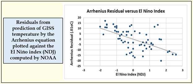
Could we see an El Niño "signal" in the GISS temperature data, even after accounting for how well the Arrhenius equation explained the trend?
We could. In the figure above, the “residuals” are the distance between the solid dots representing the Arrhenius prediction and the open circles recording the GISS data.
Here was the surprise. Plotting these residuals against the El Niño index revealed a significant relationship. Adding this as a second factor to the original Arrhenius relationship reduced the error in prediction to about 0.06 or 6 one-hundredths of a degree. Being able to detect this second relationship supports the precision of the first.
So we are on a roll here with my students and the next logical topic is predicting future climate change. Does carbon dioxide concentration "control" our climate future? The most recent report of the Intergovernmental Panel on Climate Change (IPCC) presents a dizzying array of future scenarios and climate responses derived from state-of-the-art models whose complexity makes them opaque to anyone outside the field, and difficult to explain to general audiences or first-year students.
A Simpler Prediction For the Future
Might the results from this array of complex models also be summarized by this Arrhenius equation? The biggest surprise of all in this analysis was, yes, using a set of "Assessed Warming" values, apparently they can!
Projections for carbon dioxide concentration and change in global temperature were extracted as average values across the community of climate models for 4 often-cited scenarios (see Sources below). Summarized as decadal time steps from 2020 to 2100, the Arrhenius equation with the same value of alpha (4.05), provides an exceptionally strong relationship. The average difference between the model-projected temperatures and what Arrhenius would predict is less than 19 one-hundredths of a degree (over a range of 400).
Note that the value of alpha used was the same as for the historical measurements. It was not altered to improve the accuracy of the prediction. In modeling jargon, this represents a validation - using an existing model to predict results, in this case the projections of the climate models, that were not used to construct the model.
The Take Home Messages
So, what do I hope my students take away from this exercise?
First, that there are intuitive approaches to "quantitative reasoning" that will take you a long way in understanding your data.
Second, that we can understand and present the climate change story and its cause with a relatively simple equation and set of graphics, without having to present and describe the complex state-of-the-art models (although we need the results from those models for the comparison with predicted future temperatures).
Third, while carbon dioxide is not the only greenhouse gas, it is apparently a very powerful index to what human activity is doing to the atmosphere and the global climate system.
Finally, we also know that carbon dioxide is increasing because of human action - mostly fossil fuel combustion - and that both available measurements and model projections of the future describe a key role for this indicator of climate change.
Perhaps when combined with the first three of the Four Easy Steps, this helps make a simpler and more convincing presentation showing that climate change is real and that human activity is the cause. It may also help frame the discussion about how we can address this global environmental issue.
Sources:
The citation for Arrhenius' 1908 book is:
Arrhenius, S. (1908), Worlds in the Making: The Evolution of the Universe, Harper and Brothers, New York, Translation by H. Borns, 228pp.
Sites containing global average climate data and carbon dioxide concentration are:
GISTEMP Team (2022), GISS Surface Temperature Analysis (GISTEMP), version 4, NASA Goddard Institute for Space Studies, Accessed 13 May 2022 https://data.giss.nasa.gov/gistemp/.
Scripps Institution of Oceanography, (2022), The Keeling Curve, http://scrippsco2.ucsd.edu/data/atmospheric_co2/primary_mlo_co2_record
DOI: http://doi.org/10.6075/J08W3BHW, Accessed 13 May 2022
El Niño index data are available here:
Carbon dioxide values for IPCC scenarios were accessed through:
Meinshausen, et al. 2020. The shared socio-economic pathway (SSP) greenhouse gas concentrations and their extensions to 2500 - Supplement
https://doi.org/10.5194/gmd-13-3571-2020-supplement
https://greenhousegases.science.unimelb.edu.au/#!/view
IPCC modeled temperature data were accessed through:
Hausfather et al. 2022. Climate simulations: recognize the 'hot model' problem. https://www.nature.com/articles/d41586-022-01192-2
Supplementary data - AR6 Assessed Warming tab
Assessed Warming is an average of predictions from a fleet of climate change models averaged again with results from a simple energy balance model (emulator) calibrated to reproduce the results of the more complex models.
For both carbon dioxide and temperature, values were summarized by decade. Scenarios used included: T4-SSP1-2.6, T5-SSP2-4.5, T6-SSP3-7.0 and T11-SSP5-8.5.
The complete IPCC AR6 Science report is here:
https://www.ipcc.ch/assessment-report/ar6/
Spencer Weart's web site is:
https://history.aip.org/climate/index.htm
and his book is
Weart, S. 2008. The Discovery of Global Warming. Harvard University Press.


