

An Intuitive View of the Climate System
Viewing data graphs as pictures in an exhibition


Presenting numbers and graphs in a hopefully interesting and accessible way has been a core theme of these essays. This one took the concept as far as any, asking if graphs can be approached and viewed as you would paintings in a gallery (if Mussorgsky can interpret “Pictures at an Exhibition” through music, why not view data graphs as art?). Maybe it worked - this has been a popular post.
This edited entry also updates many of the global indicators in the environmental dashboard posted in previous years - but you would never know it! The graphs are not visibly different. I’ve only added another year and another data point to each graph. We have not changed our trajectory.

Can Science and Art Converge?
Construction of this essay began with the creation of a number of graphs charting major indicators of our changing climate system. Recognizing recurring patterns in those figures brought to mind the intuitive, visual way we might encounter paintings in a gallery.
Perhaps content and color and pattern create your first impression, rather than technique or materials.
Can visual presentations of climate data be viewed in the same way – by concentrating on the form and outline rather than the specific numbers or the details of how the graphs were created?
Think of this as ignoring those tiny descriptive placards on the gallery wall next to every painting!
So this essay builds on a series of graphs that capture the major trends in the climate system since 1970, along with trends in population and economic activity that drive those changes, all set in a graphical context. Since most trends presented here can be described by straight lines, we can (with artistic license) continue those trends into the future and see where that might take us. How simple!
As you wander through these graphs, I hope you might notice first the emergent patterns in each, as you might with a painting, and then discover the consistency of those patterns across images.
(Note: All those necessary details on sources and units, as on those placards on the wall in the gallery, are provided in an accompanying essay – we do need to show that the numbers in these graphs are real!).
OK? Let’s give this a try.
A Gallery Map For Our Tour of Curated Data Sets

There are three major themes to the tour that the following images will try to convey:
1. The different parts of this system are very tightly linked. You can predict change in one from changes in others.
2. They are all moving in the same direction, driven by human actions.
3. We can change the path we are on, but it won’t be easy.
The Indicators Are Linked - Change is Continuous
Our first two images capture the impact of human activity represented in the top box in the gallery map above.

The image on the left shows the ever-upward trends in population, economic activity and greenhouse gas emissions driving climate change. However, the image on the right says that the rate of population growth is decreasing, and that while per capita income is rising, the global economy is becoming more carbon efficient (lower carbon footprint graphed as emission of carbon dioxide per dollar of GDP – gross domestic product). All good things!
But at the same time, accumulating emissions are driving a very steady increase in the carbon dioxide concentration in the atmosphere, which, along with other greenhouse gases, is driving the measured increase in global temperature, which in turn is driving increased storage of heat in the oceans.
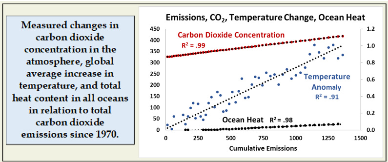
So human actions and the top four processes in the climate box are all very closely related. There are good scientific reasons why they should be, but the first time I graphed all of these simultaneously, the degree of agreement among them and the consistency in rate of change over time were astonishing.
Are the patterns in these images clear and do they communicate where we are in terms of changing our climate?
Here are a few more. Global temperature increases affect us all directly, but also indirectly through subsequent changes in other parts of the climate system.

Changes in late-summer ice coverage in the Arctic Ocean is one of the most visible effects of global warming, and the continuing loss of melting ice from the Greenland ice sheet (as an indicator of loss of land-based ice) is a major contributor to sea level rise.
Both sea level rise and an increase in tropical storm activity threaten all coastal and near-coastal communities. Both have been increasing over the last 50+ years, and both can be related to ocean heat content (or cumulative emissions, or carbon dioxide in the atmosphere – all of which are closely related!).
It is worth emphasizing again how extraordinary it is that all of these measurements, taken by different groups using very different methods, show such strong relationships.
The take home message from this first part of our graphical tour, then, is that all of the drivers and responses in the climate system are very tightly coupled and have been changing at a relatively constant rate over the last 50+ years.
Science says these relationships should be strong, these long-term data sets show that they are.
Where Are We Headed? Can We Change Direction?
Words and images have the power to help us envision the future and change the way we think and plan. I’ve just finished reading “Station 11” by Emily St. John Mandel - a novel about a post-pandemic world that was thought dystopian at the time of publication in 2014, but turned out to be more prescient than fictional (thanks again to my PALS book group for this selection). How COVID-19 has changed our our worldview!
Perhaps a few images can alter (or reinforce) our worldview on where we are headed climatically.

These result from just continuing the trends in population, economic activity and carbon dioxide emissions over the last five decades into the future. Relationships among the direct climate effects in the blue box in our map won’t change; they reflect the basic physics of the climate system.
Continuing those measured trends as straight lines out to 2075, we get a surprising result. Global warming will eventually plateau - and at a lower level than I would have expected.
If increases in the carbon efficiency of the economy really do continue as they have over the last 50 years, then we reach carbon neutrality in 2075, and all the response indicators stabilize. Human numbers will also peak at ~10 billion in 2060 and begin to decline, contributing to stabilization.
While this is encouraging, temperatures in 2075 would still be more than 1.8 degrees Celsius (3.2oF) warmer than in 1970, tropical storms in the North Atlantic might increase from 30 to 50 per year and sea levels would be at least 355mm (14.5 inches) higher (and probably much higher – see caveat on predicted sea levels in that accompanying essay).
It’s not a pretty picture, but given 50 years to prepare, perhaps the worst consequences could be mitigated – once we acknowledge that this is happening.
The second question asks if we can change direction. We can. The most sensitive variable here is the carbon efficiency of the economy. If we can accelerate the rate of increase in efficiency such that carbon neutrality occurs in 2050, then global temperature increase would plateau at less than 1.4 degrees Celsius.
If, on the other hand, efficiency gains slow to half the current rate, neutrality does not occur by 2075. Temperature increase would reach 2.4oC (4.3oF) and still be rising, and there might be 60 tropical storms per year.
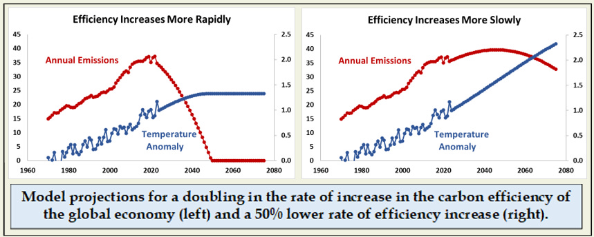
While easy to say, actually increasing the carbon efficiency of the global economy to achieve neutrality by 2050 or 2075, although a stated goal of nearly every major study and political jurisdiction, will be a huge task.
We can change direction, but it won’t be easy.
Three Images That Bring It All Together
Let’s conclude this essay and graphical tour with three final images mounted in a room of their own at the end of our gallery tour.
The first two two strikingly simple images are displayed next to each other, as might two paintings of the same subject (a garden, the human form) from different artistic eras.
Thirty years of intensive work by scientists and policy makers through the IPCC process has been distilled down to one relationship (on the left) that combines past measurements and future projections. It captures change in global average temperature in relation to total cumulative carbon dioxide emissions, and was published with this banner headline:
Every ton of CO2 emissions adds to global warming

Produced by a much simpler method derived directly from long-term measurements, our intuitive graphic approach (on the right above) yields the same relationship. Even the absolute values are similar!
Gallery patrons can decide which approach is more aesthetically pleasing, or delivers a greater impact.
As you exit this exhibition, there is a final, classic image by the door that, paired with the figures above, captures our situation as an iconic painting might capture an artistic movement. This additional image is the Keeling Curve of carbon dioxide concentration as measured on a mountain top in Hawaii, capturing the average value for the atmosphere of the northern hemisphere. Concentrations now are 50% higher than at the beginning of the industrial revolution, higher than at any time in the last 2-3 million years, and continue to increase.

Unless we can bend this curve by lowering emissions, we will continue to ride up those straight lines depicting the relationship between emissions and temperature into a warmer and more challenging future.
I hope this approach helps us think of the climate system in an intuitive way as a tightly integrated system and helps us understand where we are going and why.
We can reshape our climate future by reducing greenhouse gas emissions now while also preparing for the changes that are already certain to happen.
Postscript
But wait – what are those processes in the red box at the bottom of the conceptual diagram? They are potentially important feedbacks in the climate system that could complicate the nice clear story presented here. To learn more about these, and the caveat on predictions of sea level rise, you will have to read the other essay!
Sources
All data sources and the units in which values are expressed are presented in the accompanying essay.
The IPCC diagram can be found here:
https://www.ipcc.ch/report/ar5/wg1/summary-for-policymakers/figspm-10/
Data for the Keeling Curve can be found here:
https://keelingcurve.ucsd.edu/
Note: I’ve used the idea of a museum tour before as an analogy for presentation of the science of weather and climate. A much deeper look at both the history and science of weather and climate can be found here:
https://yalebooks.yale.edu/book/9780300259438/less-heat-more-light/