Nuts and Bolts of a Simple Model of Climate Change
A full description of the model used in Monday’s essay

With Scott Ollinger

Intuitive interactions with a model of global change are hopefully helpful, but we still need to document every step and relationship used to derive that model. Here are all the details.

A previous essay presented a simplified, data-rich tour of the global climate system as affected by human activity, and encouraged an intuitive encounter with important data sets describing the connections driving that system. The analogy offered was to paintings in an exhibition.
But perhaps this is where art and science diverge. If a painting expresses the artist’s personal condition and world view, there are no rights or wrongs. When science uses numbers to describe the past, present and future, then those numbers have to be verifiable. It is a central tenet of environmental modeling (and these two essays really are about a simple model) that full disclosure of all details of any published model must be presented.
So here are those details, which makes this essay sound more like a conventional science paper – and also makes it longer than usual. Apologies for that.
We start with the same conceptual model used for context in the previous essay. This focuses on the interactions among population, economic activity, and physical relationships in the climate system.

Building the simple model involved these steps:

The conceptual framework is the diagram above, and that structure dictated the data requirements.
Finding the right data sets was relatively easy. We can’t emphasize too frequently just how important is the excellent work done for us all by the scientists, researchers and technicians who make the measurements, analyze the data, and then make available to the public all of the numbers used here, and so many more as well.
A simple spreadsheet program allowed testing and development of predictive relationships among the variables in the data set. Using the same spreadsheet, the variables were linked by the relationships found to form the simple model. The model was used to project the impacts of different scenarios for limiting carbon dioxide emissions. Results from these scenarios were then compared with projections from the most recent report of the Intergovernmental Panel on Climate Change (IPCC).
Conceptual Framework
The figure above provides the framework. Each box represents a part of the global climate system and the arrows describe the directions in which the interactions flow. For example, increased carbon dioxide emissions drive atmospheric concentration which drives global temperature, which drives ocean heat content, etc.
Human population numbers, total economic activity, and the carbon footprint of that economic activity (emissions per dollar) are identified as important and predictive drivers of total annual emissions (top box). The processes and variables in the blue box represent basic physical processes in the climate system. We cannot change them. The three processes in the red box at the bottom represent potentially critical feedbacks that are not treated in the current model. More on them at the end of this essay.
Data
The availability of accurate, verifiable data is absolutely essential to this process. It has been said, accurately, that you can make a model do anything you want it to by tweaking the parameters, and too many models have been presented with the sole intention of supporting a previously held opinion. We can avoid that by sticking to reliable observations and being transparent about sources and assumptions.
When the modeling process works as it should, linking existing data sets through the statistical relationships among them will often highlight inconsistencies or places where new data are needed. The modeler needs to be led by the data, not the other way around.
Here are the data sets and sources used (links embedded).
Primary Data Sources
Population and Rate of Increase Wikipedia
Global Gross Domestic Product (GDP) World Bank
Carbon Dioxide Emissions Our World in Data
Atmospheric CO2 Concentration Scripps/UCSD
Global Temperature NASA/GISS
Ocean Heat Content NOAA/NCEI
Sea Level Rise USEPA
Late Summer Arctic Sea Ice Extent NASA
Greenland Ice Sheet Loss per Year NASA
Number of Tropical Storms Wikipedia
From these, the following variables were calculated
Per Capita GDP
Carbon Dioxide Emissions per Unit GDP (Footprint or efficiency)
Cumulative carbon dioxide emissions (from 1970)
The resulting spreadsheet has this structure (also includes units for each variable):

Relationships
The arrows in the conceptual diagram describe interactions – where one variable should be linked to or predicted by another. As highlighted in the accompanying essay, the strength of the statistical relationships among many of the variables in the figure is pretty astonishing, especially when you consider that they were collected independently by totally different organizations.
For example, here is the relationship among cumulative carbon dioxide emissions (the X or horizontal axis) and atmospheric CO2 concentration, global temperature, and ocean heat content.

Similar graphs can be produced for each of the arrows in the conceptual diagram, and for each of the relationships, the spreadsheet was used to derive an equation that relates the variables (captured in the dashed lines) and also a statistic labeled R2. This is called the coefficient of determination and can be stated in English as the fraction of the variation in the predicted variable that is explained by the predictor variable.
The R2 value of any relationship will vary from zero to one, with zero reflecting no relationship whatsoever and one indicating a perfect (100%) correlation. In this diagram 99%, 91%, and 98% of the variation in carbon dioxide concentration, temperature anomaly (change from long term average), and ocean heat content are directly predictable from the variation in cumulative carbon dioxide emissions alone.
Statisticians will be quick to point out that “correlation is not causation.” True. There is no reason, for example, that increases in human numbers should directly cause an increase in carbon dioxide in the atmosphere, but the chain of causation is clear. As in the conceptual diagram and graph above, cumulative emissions drive concentration, which drives temperature change, which drives accumulation of heat in the oceans. The relationships are really incredibly tight, and the science underlying them is irrefutable.
This degree of correlation among such diverse sets of information is exceedingly rare in environmental research, especially for something as seemingly complex as the Earth’s climate system. The very tight relationships here are the strongest argument that we are measuring the right variables, that they reflect an integrated and tightly connected global climate system, and that the chain of causation in that conceptual diagram is accurate.
The consistency in terms of rates of change year-to-year also argues strongly for the directional momentum now present in the climate system and how difficult it will be to deflect that momentum.
If you set out all the variables in matrix form, you can use the spreadsheet to generate R2 values for each interaction.

These relationships are all strictly statistical and only make sense if there are good scientific reasons for them – and for all of those green boxes, there are!
Graphs of some of the relationships captured in this table are presented in the previous essay.
Building the Model
In constructing this simple model, the goal is to use the strongest relationships (highest R2) that have a strong scientific explanation. The yellow and green boxes in the matrix above are the ones used in the model.
For each variable in the model, the equation resulting from the statistical analysis that yielded the R2 value was used to drive changes in the predicted variable. For example, cumulative emissions since 1970 is used to predict carbon dioxide concentration, temperature anomaly, ocean heat content and Greenland ice loss (cumulative CO2 emissions and atmospheric concentration are so tightly correlated that either one could be used interchangeably).
All of the derived equations in the model are simple linear relationships – another surprise. The predicted variable (y) is a constant (a) plus (or minus) a second term (b) multiplied by the predictor variable (x), or:
y = a + bx
Here are the actual equations used in the model. The first three change by the same amount each year.

In each modeled year, calculations proceed left to right in the columns captured above. The rate of population increase changes by year. This rate then increases total population. Per capita income and carbon footprint change per year according to the constant “a” parameter. Together, these yield total economic activity and then total emissions. These are added to the cumulative emissions, which then drive climate responses according to the equations in the table above.
And really, that is all there is to it. In the graphs below, the actual data are shown through 2022 and the equations derived from them are used for future projections.
Baseline Projection
The baseline projection of future climate conditions was generated by simply continuing the linear relationships captured in those equations into the future. The result was a bit surprising.

In this scenario, population peaks around 2060 at 9.4 billion, carbon neutrality of the global economy occurs in 2075 and CO2 and temperature plateau at the same time, with temperature stabilizing at 1.8oC above the pre-industrial level. The prediction that sea level plateaus at the same time is probably wrong, as we will see.
Comparing Predictions with IPCC Scenarios
The IPCC’s sixth assessment includes five scenarios of future carbon dioxide emissions, referred to as Shared Socioeconomic Pathways, or SSPs. We can emulate the emissions projected by those scenarios in our simple model by altering population growth, carbon efficiency and per capita income. The details of the scenarios differ, but as we will see at the end, temperature responses to cumulative carbon dioxide emissions are the same across all scenarios.
The basic scenario above looks very much like the SSP1-2.6 IPCC scenario, the second most optimistic of the five reported.

However, if we set the rate of population growth permanently equal to the 2022 rate of 8.1% per year (no further reduction in rate of growth – “a” parameter = 0), and also set the carbon footprint or efficiency of the economy at the 2022 ratio (no further improvements, “a” parameter = 0), the future looks very different.
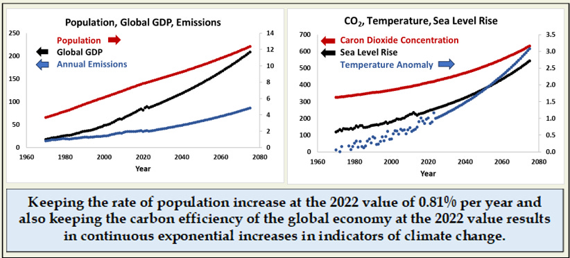
Every indicator continues to increase, most exponentially. By 2075, population approaches 13 billion, CO2 is at 630 ppm and temperature is up more than 3oC (5.4oF). With emissions reaching more than 80 BMT/year in 2075, this looks very much like the SSP3-7.0 IPCC scenario. In this and other comparisons, changing the carbon efficiency has a much bigger impact than changing the rate of population increase.
At the other extreme, if we can increase the rate of improvement in carbon efficiency by 50% and achieve neutrality by 2050, CO2 concentration would hover near 450ppm and temperature increase would stay below the target number of 1.5oC (2.7oF) cited as a goal or benchmark in many studies and reports.

This looks very much like the SSP1-1.9 IPCC scenario, which is based on actions designed to meet the goals of the Paris Agreement of 2015.
While additional scenarios could be tested, the primary lesson on emissions and temperature is clear, and has been most elegantly summarized in a final diagram in the Summary for Policy Makers from the IPCC sixth assessment. In that report, the figure on the left below is introduced with the headline:
Every Ton of CO2 emissions adds to global warming.
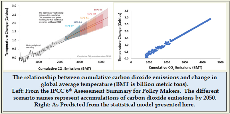
As also reported in the previous essay, the statistical model produces the same relationship, for the simple reason that the equation used to estimate temperature is a linear function of cumulative emissions. The fact that these two relationships are also so similar in terms of absolute numbers is the surprising part.
The bottom line is this: The atmosphere will warm in direct proportion to the accumulated emissions of carbon dioxide (and other greenhouse gases). That warming will continue to drive changes in other parts of the climate system.
Sea Level Rise: Shortcomings of a Simple Model
Sea level rise is perhaps the most dangerous trend in the changing climate system – and will be the most difficult to resist or mitigate. How does this simple model compare with the more complex models in projecting sea levels?
The prediction in the highest scenario here is very similar to that for the IPCC SSP3-7.0 scenario which it emulates (increase of ~17 inches from 1970 to 2075). But in the reduced emission scenarios the IPCC models predict that sea level will not plateau, but continue to increase, albeit at slower rates. The IPCC-projected increase for the SSP1-2.6 scenario presented first above is more than twice what is predicted by this simple model.
Earlier essays have described how both ice and oceans are not at equilibrium with current atmospheric temperature. Even if temperatures stopped increasing today, there is “zombie ice” in Greenland and Antarctica that would continue to melt until equilibrium with temperature was re-established. In this context, it is sobering to consider that the last time the world was as warm as it is today, ice fields in Greenland and Antarctica were much reduced, and sea levels were 15 meters (49 feet!) higher than at present.
While atmospheric CO2 and temperature equilibrate with emissions rapidly, ocean and ice responses do not. This simple model does not include those delayed responses.
The bottom line on this is that the reduced-emission, carbon-neutral scenarios presented in the graphs above, while capturing dynamics in the well-mixed atmosphere, are unrealistically optimistic when applied to changes in sea level.
What’s Missing?
In critiquing a model it is often just as important to identify what is missing as to question the relationships that are included. There are three wild cards that are not in this model; three processes or responses that could drastically alter the model’s predictions:
El Niño
The Gulf Stream or Atlantic Meridional Overturning Circulation (AMOC)
Permafrost
These are included in the conceptual diagram in the red box at the bottom, but are not linked to the model due to a lack of firm data supporting how these mega-functions might be changing.
The state of the El Niño system, monitored as change in sea surface temperature in the equatorial Pacific Ocean, has been shown to alter temperatures globally. But this system cycles about every 5 years and data so far show no long-term trends.
AMOC could be the single most important global indicator of long-term change. This massive flow of tropical water through the Gulf Stream toward Northern Europe is what allows that region to be much warmer than it should be based on latitude alone.
When this massive flow sinks in the far north Atlantic, it also mixes the increasingly warm and CO2-rich layer of surface water into the much larger deep ocean layers, a process that helps slow the rate of global temperature increase. It may also either drive or be very indicative of the state of the global ocean circulation system.
There are indications that this rate of flow has changed over geologic time, but current measurements are inconclusive.
There are good reasons to believe that both AMOC and El Niño could be affected by increasing heat storage (temperature increases) in the world’s oceans, but that is a topic for another essay.
Available information conclusively shows that permafrost in the Arctic (regions where soils never thaw completely) is retreating north. What is still unclear is the actual rate and the impacts of this thaw on global budgets for both carbon dioxide and methane. Impacts on the global climate system could be significant.
These three represent wild cards in the climate system, and need to be monitored continuously. If they start to change significantly, all bets are off, and we will need to add some additional equations to this simple model.
Sources:
All data sources are embedded in the table above.
The IPCC diagrams are from the 6th assessment and can be found here:
https://www.ipcc.ch/report/ar5/wg1/summary-for-policymakers/
IPCC model projections for sea level rise under different emissions scenarios can be found here:
https://sealevel.nasa.gov/ipcc-ar6-sea-level-projection-tool?type=global
This is a great essay and clear analysis. Is the spreadsheet available or do we have to build our own?
Thanks,