

Greenhouse Gases Drive a Warming World
An interactive graphic that eliminates alternative explanations

I recently zoomed in to a public talk by Dr. Elizabeth Burakowski from the University of New Hampshire. The topic was how a warming world will affect that state and the New England region, and especially the likely impacts on snow-related activities. The talk included both personal reflections on the loss of snow cover, and the economic impacts we can expect.
As part of that talk, Dr. Burakowski presented an interactive graphic that delivered a lot of information on a wide range of natural and human factors that could be causing the constant rise in global temperatures. I usually prefer not to use commercial sites in these essays, but as Dr. Burakowski said, sometimes those sites produce high-impact, high-value graphics.
I won’t try to embed the graphic here, but you can find it at:
https://www.bloomberg.com/graphics/2015-whats-warming-the-world/
What I will do is walk through the steps in that interactive graphic and add a little extra explanation to each. Earlier essays in this series have described how long we have known about the direct link between carbon dioxide and global temperatures and also when that direct link might be broken. This data-intensive Bloomberg site takes a different approach; demonstrating that several alternative environmental factors sometimes offered to explain rising temperatures can be dismissed.
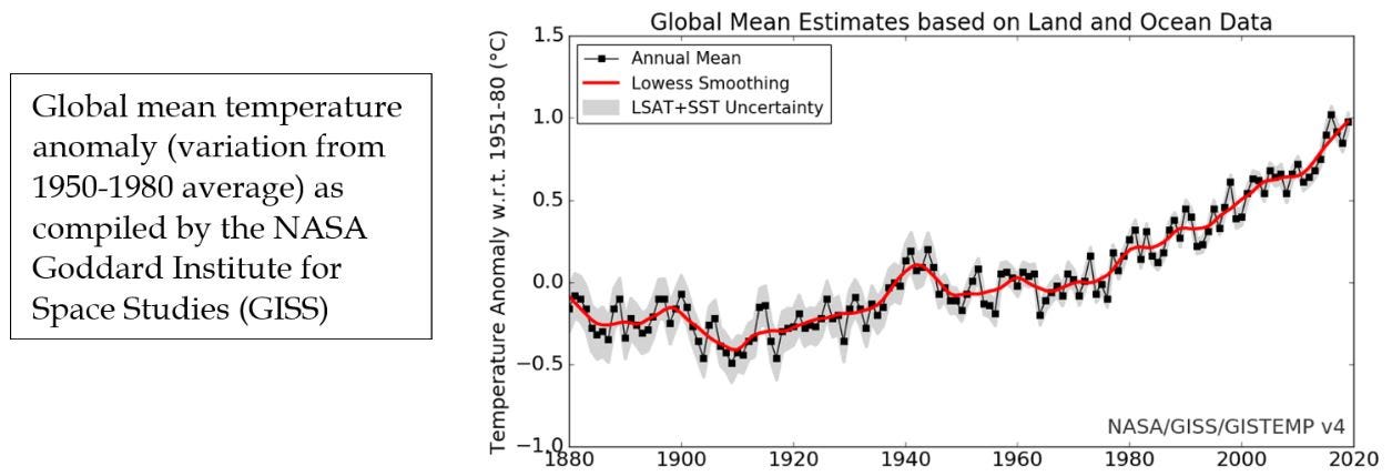
The first graph on the Bloomberg site is the measured increase in global average temperatures as summarized by NASA’s Goddard Institute for Space Studies (GISS). The data are presented as mean annual temperature anomalies; the average value for each year minus the average for the period 1950-1980. That GISS site also includes estimates for this trend produced by other research organizations, all of which are in close agreement. The graph depicts not only an increase in global mean temperature, but also an increase in the rate of that increase (note that this figure records temperature change on the Celsius scale. A 1 degree change on this scale would equal 1.8 degrees Fahrenheit).
Scrolling down through the Bloomberg site, the next addition is the impact of changes in Earth’s orbit around the sun. It is generally accepted that subtle changes in this orbit initiate the cycle of global glacial advance and retreat captured in the term “ice ages” (there have been several over the last 800,000 years). However, a complete cycle of advance and retreat takes about 100,000 years, so these subtle changes in orbit occur too slowly to have impacted global temperatures over the 125 years portrayed in the graphic.
The next section down shows that the intensity of sunlight reaching the Earth also varies over time. There is the recurring notion of an 11-year "sunspot" cycle that could drive unusual weather patterns. As shown in the graphic, measured variation in solar intensity is also too small to be important.
The next line down shows that volcanoes can have a significant impact on global climate. Major eruptions can spew millions of tons of ash and sulfur compounds into the atmosphere. Ash and aerosols (tiny particles including those sulfur compounds mentioned in the graphic) can increase the reflection of sunlight back into space, reducing solar warming of the atmosphere and surface, and reducing global temperatures. The role of aerosols, especially those created by human activity, were presented in an earlier essay on preferential warming in the Arctic.
The volcano line on this graphic shows the effects of major eruptions, especially in 1883 (Krakatoa) and 1991 (Pinatubo). Each event resulted in global cooling, but the effects were short-lived, as both ash and aerosols tend to fall out of the atmosphere in a few years.
The next step in the graphic shows the combined effects of the previous three natural factors. The comparison with the observed changes in temperature shows that these three have had relatively little long-term effect and do not match either the trend or amount of change since 1880.
The next three lines reflect changes in human activities.
The first presents the effect of land use change. The text on the image describes the transformation of dark forest landscapes to lighter cleared or paved spaces, with an increase in the reflection of sunlight back to space, and a resulting decrease in temperature. In a previous essay we presented the impacts of land use change and carbon fertilization on forests as well. That analysis suggested a slight reduction in carbon dioxide in the atmosphere, and hence a slight cooling. This change in reflectance adds to that cooling effect.
Ozone, the subject of the next line, has a complex set of chemistries and some offsetting impacts on climate. Ozone is a highly reactive molecule that is also very effective at absorbing the shortest wavelength and highest energy sunlight we receive (Ultraviolet or UV radiation – what those sunblock lotions are designed to protect against). The loss of ozone in the upper atmosphere endangers animals and us by increasing our exposure to this form of radiation. In the lower atmosphere, ozone is part of the “smog” that impairs visibility and health in urban areas. As shown here, its effect on net energy gain, and on global temperatures, is minimal.
Human generated aerosols (dust and other particles emitted by combustion and some other major sources) do have an important effect on climate, but the impact is to reduce, not increase, global temperatures. Again, the chemistry and physics of aerosols is complex, but the overall impact of the particles themselves and their additional impact on cloud formation, is to increase reflection of sunlight back into space (just like volcanic aerosols do), and to reduce temperatures.
The last two frames in this site show the calculated impact of greenhouse gases on global average temperature, and then the effect of all of the factors combined. Observed temperatures are somewhat below that calculated for greenhouse gases alone, as all of the other factors combined (and especially aerosols) have a net cooling effect.
At the bottom of the graphic there are a set of buttons that allow you to switch among the natural and human factors driving changes in global average temperature.
Overall, this interactive graphic presents something of a guided tour of the factors modifying global temperatures, and makes the case clearly that greenhouse gases are by far the most important. Neither the Bloomberg site nor the essays on this Substack site propose solutions or policies, but simply present the science. In that sense, we end here with the same sentiment expressed in the text at the end of the Bloomberg graphic. This is, indisputably, what we know. Now what are we going to do with this knowledge?
Sources
Scroll below the graphics on the Bloomberg site for researchers and projects which have yielded the data used. Also included are links to a number of sites where the raw files of observational data and model projections can be found.