

Happy New Year! How Did We Do in 2023?
Updating a dashboard that tracks global change

Welcome to 2024!
A new year can inspire us to start fresh, look for new opportunities and move in new directions.
For this Substack site, the new year also means updating the list of 12 indexes I proposed last year as key indicators of state and change in the global system we now control. How did we do in 2023? What is ahead for 2024?
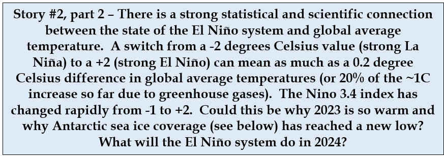
While many indicators continued to change at a relatively constant rate, there were a few surprises, including one involving global temperatures, El Niño and Antarctic sea ice that I think may become the big weather story of 2024.
Readership has more than doubled since the original list was posted in November of 2022 (thank you!). For those new readers, the entire list is repeated here in abbreviated form. A more complete description of indexes in general and of each chosen indicator is in the 2022 post. If you’ve seen this list before, you might want to just review the figures (there are two new ones) and focus on the questions in the blue boxes and the Recap at the end.
Happy New Year!
Indicators of Global Change
While reviewing the list of indicators for this annual update, they began to fall into a pattern that I should have recognized before, but hadn’t. They are good indicators because they capture critical cause-and-effect relationships among human activity, the atmosphere, the oceans, and some other environmental touchpoints. As I sketched them out into a single framework, a simplified set of steps in the global response chain emerged.

The process of completing this diagram also led to the identification of two important indicators missing from the original list of 12 - ocean heat content or temperature, and an index to total tropical storm energy. These have now been added, making a total of 14 indicators.
This figure presents the key linkages among them. Each box represents one of the indexes updated and discussed below, but it might be useful to explore the linkages among the 14 indicators first.
Linkages Among the Indicators
Proposing human population as a key driver in global change was an unusual step in last year’s list. As population drives so much of global change, it is intriguing to me how rarely it is part of the climate discussion. If anything, recent reports have stressed the downside of falling numbers in some countries.
Stepping through this diagram, economic activity, driven in part by population, in turn drives emissions of greenhouse gases, which leads to increases in the concentration of those gases in the atmosphere (indexed here as carbon dioxide concentration). Increased greenhouse gas concentrations then drive increases in global temperatures, in turn driving increases in ocean heat content and temperature.
Warmer oceans drive sea level rise through thermal expansion and also lead to loss of sea ice. They also feed heat back to the warming atmosphere, and the two together then drive increased total energy in tropical storms and hurricanes.
Rising temperatures drive increased melting of land-based ice, primarily in Greenland and Antarctica, which then also contributes to sea level rise.
The two lighter blue arrows represent links to large-scale ocean circulation systems whose ties to marine warming are not yet clearly known, but that represent critical parts of the heat engine that is the global climate system.
Three indicators extend the monitoring of human impacts beyond the climate system to include the production of food and its impacts on nitrogen pollution and eutrophication, and also on forest cover. A final index is the ozone hole, a general indicator of the world’s ability to control an important health-related chemical pollutant.
In the updates below, you will note that the most important changes we are causing in the global system are happening slowly, but with a momentum and continuity that will be hard to redirect. That fact is often missed in the recurring stories in the 24-hour news cycle that focus on the immediate weather disasters rather than ultimate causes.
Updating the Indicators
Many of these key indicators have continued to show a constant rate of change. The few that have altered course offer a hint of the impact of COVID on the climate system and an emerging El Niño event that could already be affecting global temperatures and sea ice and that I think could become the biggest weather story of 2024. These and two other global change stories are highlighted in the blue boxes below.
Population, Economic Activity and Greenhouse Gas Emissions

A 46% increase in the carbon efficiency of the global economy (decrease in Emissions/$) since 1990 has been offset by the increases in population (N) and economic activity per capita (GDP in $/N) that drive increased emissions. The impact of COVID can be seen in the slight dip in 2020. Is the apparent leveling off in total emissions before 2020 a real trend? Data from the next couple of years may answer that question.
Changes in the Climate System
Carbon Dioxide Concentration in the Atmosphere

This primary icon of the global change era captures the impacts of all of the things we do in terms of transportation, industry, agriculture, and land use on this most important greenhouse gas. While the first graph above suggests that emissions dipped slightly in the COVID era, that deviation was apparently too small to alter the rate of accumulation of carbon dioxide in the atmosphere. The current concentration is more than 420 parts per million, or more than 50% higher than the pre-industrial value of ~278, and higher than at any time in the last 3 million years.
Global Average Temperature
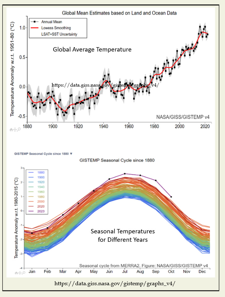
This index (upper figure) shows a leveling off in the rate of increase in global average temperatures after 2019. The interesting story unfolding in 2023 is that global average temperatures for nearly every month this last year (lower figure) have been above any values previously reported. The purple line at the top of this figure is for 2023. The lower colored lines range from 1880 at the bottom (blue) to 2020 at the top (red).

El Niño

The El Niño/Southern Oscillation, or ENSO system is a recurring pattern of rising and falling sea surface temperatures in the central Pacific Ocean. NOAA uses an index known as Niño 3.4 to chart trends in this system, and we use that here as well. It is a three month running average of difference from the long-term average (anomaly) in sea surface temperature (SST) in the defined region (within that red tongue on the map). There is no long-term trend in the frequency or magnitude of this index (right image), and any firm connection between ENSO and overall ocean warming has yet to be established. However, the rapid shift from -1 to +2 in this index in 2023 (lower left figure) and a strong statistical relationship with global average temperature would predict the kind of major warming trend seen in the 2023 temperature numbers above.
Ocean Heat Content and Temperature

A warmer atmosphere warms the oceans as well. An estimated 90% of total excess heat accumulated in the Earth’s climate system as a result of increased greenhouse gases has been transferred to the oceans – and the trend continues. The diagram at the top of this essay shows the central importance of warmer global oceans (and that is just for climate – this is also critical for coral reefs, ocean heat waves, and distribution and viability of many important marine species). It may be hard to relate to “zetajoules” – but that is a very very large amount of heat!
Accumulated Cyclone Energy

This index is new this year. Human suffering and property damage due to tropical storms and hurricanes that make landfall have increased dramatically, but an index based on, say, the dollar value of damage would be inconsistent as the fraction of storms that make landfall is a somewhat random feature, and the increased density of people and the value of property in the path of hurricanes has also increased. A better index would relate to the total energy released by all tropical storms in a year, whether they make landfall or not.
ACE – Accumulated Cyclone Energy is just such an index, and is new to our list this year. This is truly an index and not a direct measure of energy, but is calculated as a sum of the total area covered by each storm over its entire lifetime. This is easily accessible by satellite, where detailed information on rainfall and windspeed within a storm are not. The website used here includes both the number of storms and total ACE. Only data for years after 1960 are presented, as that is the year that the first weather satellite was launched.
Trend lines suggest a doubling in the number of tropical storms (including hurricanes, left figure) and a 50% increase in ACE (right figure) since 1980.
These numbers are for Atlantic storms only.
Loss of Land-Based Ice

Loss of ice from the major land-based ice sheets in Greenland and Antarctica also continues at a constant rate (data for Greenland is the index used here). A recent definition of “zombie ice” – ice that will melt no matter what we do to change the climate system - suggests that this rate of loss will continue for decades.
Sea Level Rise

Melting of the Greenland and Antarctic ice sheets and increases in ocean temperature leading to thermal expansion drive sea level rise. This is probably the most dangerous long-term impact of global warming, and the one that will be hardest to reverse. The momentum behind this increase due to the long-term absorbance of heat from the atmosphere, the constant melting of those major ice caps, the existence of “zombie ice” and our understanding of the 1000-year global cycle of ocean circulation, all assure that this trend will continue through the end of the century. The last time carbon dioxide concentrations were as high as today, sea levels were about 50 feet higher than they are now.
Floating Sea Ice

Unlike the loss of land-based ice, melting of ice already floating in the oceans does not lead to sea level rise, but can be a sensitive and very visible indicator of a warming climate system. Our index is the long-term measurement of the extent of sea ice coverage in the Arctic Ocean in late summer (figure on the left), which varies year-to-year but shows a continuous long-term decline. Projecting this data set into the future suggests that the Arctic Ocean will be totally ice free at the end of the summer by about 2075.
There was one notable event relating to sea ice in 2023. The amount of ice afloat in the Antarctic Ocean that surrounds that immense continent holding the vast majority of the Earth’s ice, was measured at the lowest value ever recorded (figure on the right). Whether this solidifies a trend begun around 2008, or is just an outlier in a flat 45-year record depends on how much of the timeline you include (note the two different trend lines in the figure). Blip or new trend? We’ll have to wait for a few more years to decide.

Rate of Flow in The Gulf Stream

This indicator was in last year’s list, but the data source used last year seems to have disappeared. So, we now have a new source, one that measures changes in sea surface temperature (SST) at two points in the Gulf Stream’s path to estimate change in rate of flow. A drop in SST in the blue region in the map and an increase in the red region would result from a slower rate of flow south to north. A slowing of the Gulf Stream could spell colder winters in Northern Europe and may indicate a change in the global pattern of sea water circulation with many potential impacts.
Changes Outside the Climate System
Last year’s set of indicators included 4 that are not directly climate related, but certainly interact with climate and human numbers. None of these have changed significantly this year.
Food Production Per Capita

Increases in grain yields per acre (or hectare) since WW2 have been phenomenal. Increased fertilizer production, especially of nitrogen through the Haber-Bosch process, and genetic improvements captured in the term Green Revolution, have driven large increases in yield with little increase in the amount of land in cultivation. So far, this increase has kept ahead of population growth, so that yields per capita have also increased.
The Dead Zone

However, excess applications of nitrogen lead to runoff from farmlands and eutrophication of adjacent surface waters. The Mississippi River watershed includes some of the most productive and heavily fertilized farms in the world. The upshot of both food production and consumption within this watershed is a tremendous flow of nitrogen into the Gulf of Mexico at the mouth of the river. As currents carry this excess off to the west, a huge area of oxygen-depleted water forms each summer. The maximum extent of this zone is measured each year and varies widely depending on seasonal weather conditions, especially the occurrence of tropical storms. The 5-year running average (upper dotted line in the figure on the right) has not changed significantly and remains well above management goals (straight dotted line) . Hypoxia zones, as they are called, form at the mouths of several major rivers around the world.
Carbon Storage in Forests
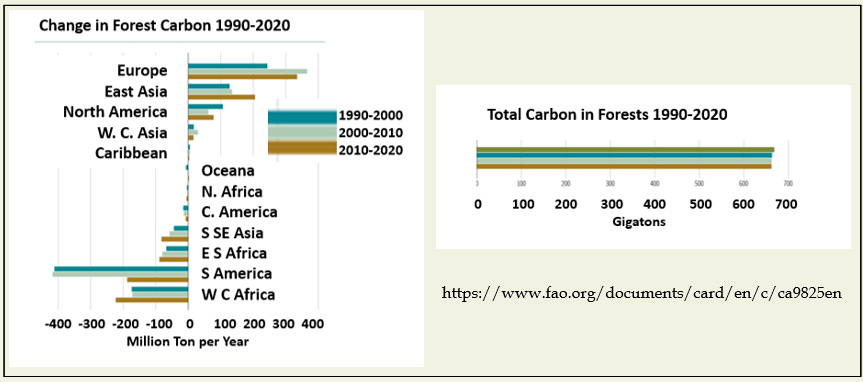
Forests hold the largest accessible reservoir of carbon in the Earth system. Deforestation releases much of that stored carbon to the atmosphere. Rates of loss in the tropical forests of Africa and South America have been measured for decades. Gains in some wealthier countries result from forest regrowth, new plantations, and possible increases in growth rate.
This index has not changed this year as the data set used is gathered only once a decade. While news stories contain much on both deforestation and reforestation, the net impact is hard to determine. Total forest carbon decreased by about 1% from 1990 to 2020 according to this FAO study, but we will have to wait for the next update in 2030 to see if that rate has changed.
CFCs and the ozone hole

The discovery of the ozone hole over Antarctica, the simultaneous discovery of its cause (chlorofluorocarbons or CFCs), and the nearly simultaneous development of an international agreement (the Montreal Protocol) to "solve" the problem is one of our best environmental success stories. The graph on the left captures both the rapid loss of ozone over Antarctica as CFCs began to reach the ozone layer in the upper atmosphere, and how that loss has been stopped and partially reversed since the Montreal Protocol in 1989. The graph on the right shows the same trends expressed as the more familiar size of the "ozone hole." In recent years, there have been reports of rogue emissions of CFCs from small-scale industrial activity in different parts of the world, and total ozone concentrations in the atmosphere over Antarctica are still only about 1/2 pre-CFC values. There is also considerable variation among different measurements.
Recapping the Top Stories
The slowing increase in global average temperature after 2019 was likely caused in part by the strong and unusually long La Niña event from 2020 into 2023. The ENSO indicator has now shifted rapidly towards a strong El Niño condition. The impact of this change may already be evident in the highest monthly temperatures ever recorded for most of the months in 2023, and possibly to loss of Antarctic sea ice as well. What will El Niño do in 2024?
And will total emissions of greenhouse gases continue to level off or return to a pre-2015 rate of increase?
Stay tuned!