

We Should Have Expected A Very Hot 2023
The fundamentals of the climate system have not changed and warming might pause again by the end of 2024


Global average temperature in 2023 was well above 2022 and broke all previous records. This led to a flurry of media reports suggesting that some fundamental change in the climate system had occurred and that we could not predict the future. This essay suggests that the large increase in temperature from 2022 to 2023 is exactly what we should have expected based on the long-term trend in rising temperatures due to greenhouse gases and the state of the El Niño/La Niña oscillation.
With Scott Ollinger and Stephen Frolking

Predictability, Not Confusion
Last year (2023) was the warmest on record. That should not have been a surprise. We have access to three long-term, very high-quality data sets that can, based on solid climate science, explain most of the big increase in temperature from 2022 to 2023.
What is surprising, then, is that we hear so much in the media about confusion among climate scientists and the inability of complex global climate models to predict that increase. While one article in a science journal emphasized the need to improve models for future predictions, other presentations (see Source below) describe several processes that could account for the sudden increase.
We need to know that we understand the climate system in order to manage our climate future.
So perhaps a simpler look at those three data sets that chart the state of the system can help tell us where we are headed and why the rate of change might vary a bit year-to-year.
As we begin this data journey, it bears repeating that we owe a great deal to the dedicated researchers, scientists, and technicians who collect, assure, curate, and make available the fundamental data sets we need to understand where the climate system has been and where it is going.
Trace Gas Concentrations Drive Temperature Increases
The University of California at San Diego, through its Scripps Institute of Oceanography, houses the data set that captures the “Keeling Curve” - direct measurements reported since 1958 of the carbon dioxide concentration in the atmosphere as measured atop Mauna Loa or Mauna Kea in Hawaii. This icon of the global change era should be familiar to everyone, but remains unrecognizable to most.
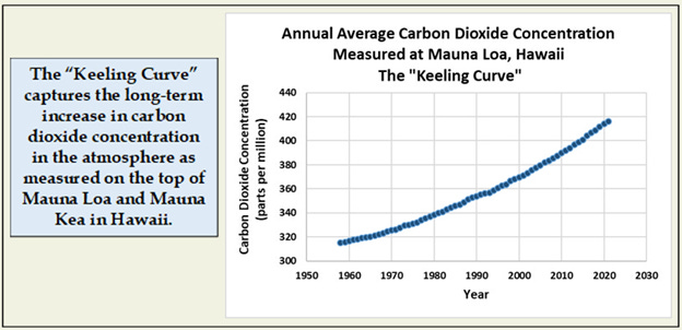
Carbon dioxide was at about 278 on this scale before the industrial revolution, is higher now than at any time in the last 2 million years, and is increasing steadily.
The Goddard Institute for Space Studies (GISS), a NASA Research Center, compiles and continuously updates a data base of global average surface temperature over both land and sea. This data set has been reconstructed back to 1880 and tracks the continuing increase in warming at the Earth’s surface. The years coinciding with the Keeling curve are plotted here. Note that 2021 and 2022 are below the trend line and 2023 is above it.

The similarity in these two lines is what you would expect given that carbon dioxide is the most important greenhouse gas responsible for trapping heat radiation from the Earth’s surface and raising temperatures globally. It is not the only greenhouse gas, but other major contributors (like methane and nitrous oxide) have changed in proportion to carbon dioxide, so far.
For all the science demonstrating that there should be a relationship between these two measurements, when you consider the complexity of developing these data sets, the degree of correlation between them is remarkable. In the figure below, the dashed line is a statistical fit that describes that relationship. The variation around this line, or the “noise” in the relationship, is small relative to the scale of the trend. More than 93% of the change in temperature is explained (statistically) by change in carbon dioxide concentration alone.

This should be old news now but is lost amid all the media attention given to recurring climate disasters and the now proposed “confusion” as to why 2023 was so hot. Again, few are aware of this simple and straightforward relationship, and how strong it is. And again, 2021 and 2022 are below the line and 2023 is above it, but they are not obvious outliers from the long-term trend.
As tight as this relationship is, there is another climate process that might explain some of the “noise” and make the correlation even stronger.
Oscillations Like El Niño/La Niña Add Noise to the Trend
What looks like noise to one scientist can be data to another.
Oscillations are cyclical changes in critical parts of the climate system that can deflect annual temperatures from the steady path predicted by carbon dioxide alone. One of the most powerful and best known is the El Niño/La Niña (or ENSO) oscillation measured as changes in sea surface temperatures in the equatorial Pacific Ocean.
ENSO can explain some of that interannual noise in global average temperature.

NOAA’s Weather Service tracks sea surface temperatures in this region and reports it as a three-month running average difference from the long-term average. When this metric is more than 0.5 degrees Celsius above that long-term average, they declare an El Niño condition (red squares in this table). When it is more than 0.5C below that average – that is a La Niña (blue squares).

Noise Becomes Data
But there is more information here than just the El Niño/La Niña designation. The degree of deviation from the long-term average, the actual number in each box, holds the key to explaining the switch between 2022 and 2023.
The Pacific is so vast that even a degree or two increase in surface temperature has been shown to warm the atmosphere significantly and affect weather patterns in many parts of the world.
As the ENSO index can change rapidly month-to-month, comparisons with global temperature need to be at this scale as well. Temperature data graphed below are expressed as anomalies, or difference from the average for the period 1995-2024.
This period includes 3 of the 5 strongest El Niños measured since 1950. The peaks in the ENSO index (blue line) capture the strong El Niños of 1997/98, 2015/16, and 2023/24. Weaker events peaked in 2003 and 2010. Over the 75 year record, an official El Niño event has occurred about once every 5-6 years.

Changes in global temperature (red line) tend to lag behind changes in the ENSO index (blue line). It takes time for the extra heat to work its way through the climate system. The best relationship between the two is when temperature anomaly in each month is compared with the ENSO index from 3 months prior but correlations are nearly as strong for 1 and 2 month time lags. The dashed line that describes this relationship in the figure below suggests a swing in temperature by as much as 0.4 degrees Celsius across the total ENSO range from -1.5 to +2.5.
Changes in temperature are even more pronounced during the transition from a strong El Niño event to the ensuing La Niña, averaging a drop of 0.5 degrees Celsius (see examples in the figure above).

What this means is that the expected global average temperature is related to BOTH the carbon dioxide concentration in the atmosphere (long-term), and the state of the ENSO system (month-to month), and that rapid declines in both the index and temperature tend to occur after a major El Niño event.
So How Does This Make 2023 Predictable?
The 29-month La Niña event from 2020 into 2023 was the longest in the record and slowed the increase in global temperature for more than 2 years. From late fall 2022 to the end of 2023, the index rose from -1.0 to +2.0, only the 5th time that this index has reached that high level since 1950. This large and rapid increase in sea surface temperature in the tropical Pacific, as captured in the ENSO index, drove that extraordinary increase in global atmospheric temperature from 2022 to 2023.
But even with that rapid increase, the global temperatures for 2023 were not outside the historical range of year-to-year variation. The climate system has not shifted to a new state, but keeps moving in a dangerous direction at a steady pace.
And A Prediction for the End of 2024
These graphs represent a simple statistical model of changes in global temperature to be expected from cyclic swings in the ENSO index. Any model, even such a simple one, can be challenged to make predictions about the future, and those predictions can be compared with measurements as they accumulate. To make a prediction for the end of 2024, we need to have estimates of carbon dioxide concentration and the ENSO index for the coming December.
Carbon dioxide is easy as the rate of increase does not change dramatically from year-to-year.
What about ENSO?
NOAA’s Weather Service also offers a prediction for near-future changes in the state of this system. Here is what that predicted future looked like in April of 2024.

If the consensus predictions are accurate, then sea surface temperatures in the ENSO region in the central Pacific at the end of 2024 could be nearly 3 degrees Celsius cooler than at the end of 2023 – as big a swing as happened in the opposite direction from 2022 to 2023. Again, previous drops in the ENSO index of this magnitude have been followed by an average decline in global temperature of about 0.5 degrees Celsius.
This figure includes a shorter timeline so that a projection of what this might mean for the rest of 2024 will be visible.
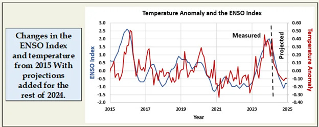
Even if there is a 1- to 3-month lag time between changes in ENSO and global temperature, we should still expect a slow down in the rate of increase in average temperature by the end of 2024 and into 2025. There should be no continuation of the dramatic increase recorded for 2023.
Predictable But Not Comforting
And here is where the concern comes in (or danger if you want to be dramatic). If the “confusion” argument is accepted and the consensus is that climate experts could not predict what happened in 2023, and then a pause in warming occurs in 2024 and is also deemed unpredictable, that would provide much fodder for anyone who wants to say that we can’t predict climate change so we really shouldn’t do anything about it.
But this is all very predictable. We do know that climate change is happening and we do know why, thanks to the good people responsible for the GISS, Keeling Curve and ENSO data sets, and many other dedicated climate scientists.
So the bottom line here is that 2021 and 2022 were much cooler and the second half of 2023 was much warmer than would be predicted by carbon dioxide alone due to the state of the ENSO system. That big swing in global average temperature from 2022 to 2023 was NOT inexplicable. It is what would be expected from a combination of changes in carbon dioxide and ENSO.
But there is little comfort in this. If we renew our confidence in being able to predict both the long-term trend and year-to-year variation in temperature, the unavoidable conclusion is that the world will continue to warm, unless we alter the trajectory of the Keeling curve by reducing emissions of carbon dioxide and other greenhouse gases.
The fundamentals of the climate system have not shifted or changed. It is going to keep getting warmer, and ENSO and other oscillations will only add a bit of noise to the trend.
Sources:
An interesting, graphical presentation of the rise in carbon dioxide concentration is here:
https://www.nytimes.com/interactive/2024/04/20/upshot/carbon-dioxide-growth.html
Sources that discuss the role of the ENSO system in driving changes in temperature year-to-year, and the need to improve models include:
https://earthobservatory.nasa.gov/images/152313/five-factors-to-explain-the-record-heat-in-2023
https://www.climate.gov/news-features/blogs/enso/where-does-global-warming-go-during-la-nina
https://www.nature.com/articles/d41586-024-00816-z
https://www.columbia.edu/~mhs119/Temperature/Emails/Annual2021.pdf
https://www.columbia.edu/~mhs119/Temperature/Emails/Annual2022.pdf
The data for the Keeling Curve can be found here:
https://keelingcurve.ucsd.edu/
The GISS global temperature data set is here:
https://data.giss.nasa.gov/gistemp/graphs_v4/
The U.S. Weather Service weekly updates on the ENSO system, including predictions for the future, are here:
The image of Pacific Ocean temperatures during a strong El Niño is from: