I have never been a big fan of "tipping points" - perhaps because we so often hear exaggerated claims that "we are right on the edge" or that "everything is about to change."
But my group of friends struck again at our recent book club meeting, at which Black Swans (by Nicholas Talib) was discussed. Talib defines a Black Swan as something sudden and unexpected that changes your world view. His example is thinking that all swans are white, until a rare and exquisite black one is seen for the first time. The author makes the point that we cannot predict these events, and so can't prepare for them, and are left to respond to a crisis rather than prevent it.
A conversation about tipping points was a natural follow-on, and climate change became the focus. Are we approaching tipping points in the climate system - a time where changes will accelerate and be irreversible? An earlier essay suggested 12 indicators that track changes we are making in the global environment. One summary conclusion was that while almost all showed us heading in a dangerous direction, they also were all changing continuously - no tipping points predicted.
Even if you're not a fan of tipping points, it is still definitely true that the climate system is rife with what are called positive feedbacks - where a change in one part of a system leads to accelerated changes in the cause of that first event, further accelerating the response.
That sounds theoretical, but think of what would happen if someone reversed the wires on the thermostat on the heating/air conditioning system in a room such that colder temperatures turned on the A/C and warmer temperatures turned on the furnace. And then imagine that the warmer the air, the more heat the furnace would generate. That is a positive (meaning self-reinforcing, not "good") feedback.
Ice offers a great example of a positive feedback in the climate system. Losing ice cover due to increasing temperatures, as is happening in the Arctic Ocean, means less reflection of sunlight and more absorbance of the sun's energy by the now exposed water. Less ice -> warmer water -> less ice -> warmer water, and so forth.
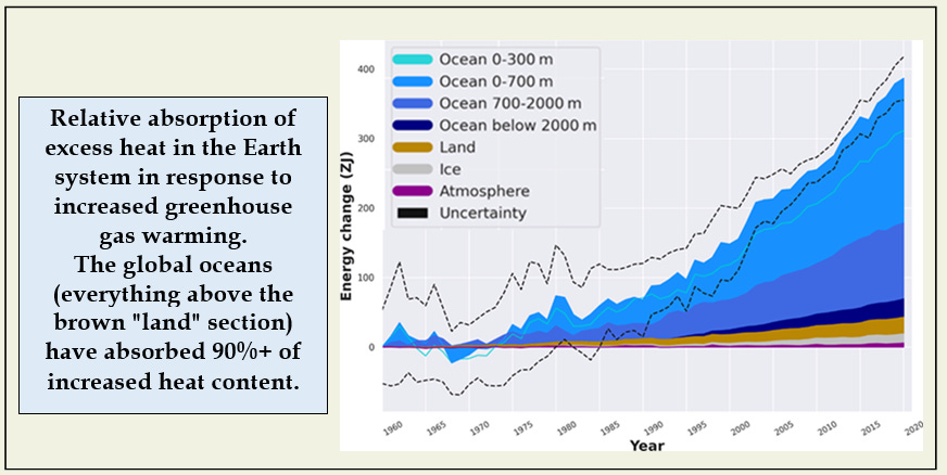
Another essay described ways in which ice and oceans have slowed the pace of climate change, meaning that we have seen less warming and sea level rise than we might have, given our emissions of greenhouse gases.
For example, the global oceans have absorbed 30-40% of the carbon dioxide we have emitted (depending on your time frame), and have also absorbed ~90% of the excess heat generated by the greenhouse effect. Both of those processes have limited the increase in the air temperatures we experience and that drive our weather.
And while the major ice caps in Greenland and Antarctica are seriously out of balance with global temperatures, they are melting slowly and maintaining more ice mass than would be expected at current and near-future temperatures. Hence the identification of "Zombie Ice," frozen water in the major ice sheets that is already committed to melting, even if temperatures were to stabilize.
Maybe the difference between tipping points and strong positive feedbacks is just semantic. The key in either case is knowing how to identify accelerated rates of change in key parts of the Earth's systems, many of which are already outside historic ranges.
New measurements of ice and oceans reported this year might suggest acceleration, but short-term changes need to be placed in the context of a long time series of measurements to distinguish a radical change from normal variation around a continuous trend. And the longer the measurement history the better.
Let's start with an indicator that shows strong directional change, but no recent increase in rate.
Reduction in the minimum coverage of sea ice in late summer in the Arctic Ocean has been one of the most visible responses to a warming world. An excellent visualization of this progressive change can be seen here. Data available since 1979 show a progressive but constant decline. You could, and some have, continue this line into the future and predict that the Arctic Ocean will be completely ice-free at the end of the summer by about 2070.
You can see the importance of a long-term data set here. If we only had measurements from 2008 on, there would be no significant trend. The full data set gives the most complete picture, minimizing the effects of small year-to-year variations.
Let's point out that the melting of floating ice, as in the Arctic Ocean, does not cause a rise in sea level, just like an ice cube melting in your glass does not raise the level of the liquid. It does, however, impact the reflection of sunlight.
Similar continuous trends are visible in global average temperatures, sea level rise, and carbon dioxide concentrations in the atmosphere, all of which made my list of top 12 indicators. Continuity makes it possible to envision future environments, like an ice-free Arctic Ocean, and prepare for those futures, or try to avoid them.
But here are two recent reports that suggest increasing rates of change in ice and oceans. Tipping points? A long data set adds perspective to the reply.
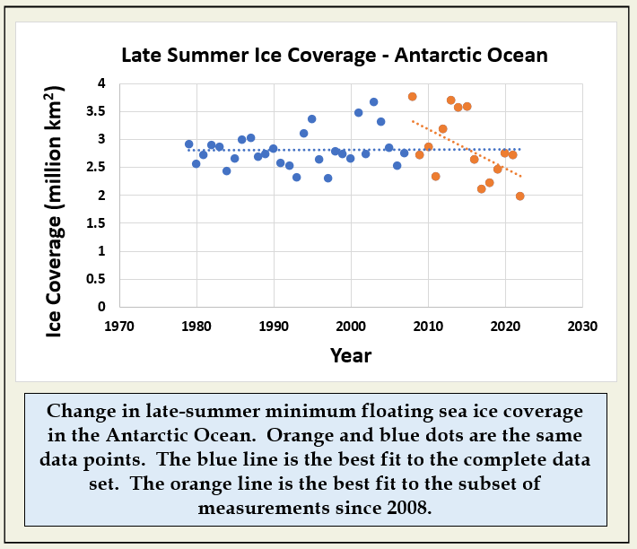
In addition to containing the vast majority of frozen water held on land (ice that will raise sea level if it melts), Antarctica is also surrounded by floating ice as found in the Arctic Ocean, ice that also reflects sunlight. The extent, area, or coverage of floating ice varies from summer to winter, and this graph shows measured late-summer minimum sea ice coverage since 1979.
While the massive Antarctic ice sheet is losing water at a relatively constant rate, the amount of sea ice surrounding the continent has been described as constant. As with Arctic ice, you could draw a different conclusion using a subset of the most recent data, but the full set shows no significant trend. To accept a trend of declining coverage since 2008, you would have to identify a mechanism that might have caused it. Otherwise, it is just part of long-term natural variation.
But then notice that the lowest year is also the most recent. Was 2022 the beginning of a tipping point? A recent report shows that not only was 2022 the lowest full year, but that 2023 is well below any previous year, especially for the onset of winter from June into August.
So one indicator of change suggests a very unusual year is unfolding. Is there another?
A second recent report looks at globally averaged ocean temperature. Again, while 2022 was near the top of the series, 2023 appears to be, at least so far, outside the range of all previous observations.
Could either of these represent the beginning of a tipping point?
Simple statistics like this (although built on incredibly sophisticated and technologically advanced measurement systems!) can only take you so far. Black swans and tipping points suggest that we don't know why these changes are happening, that we can't predict them, and that is not entirely true.
There is a large community of climate modelers who compile the basic physics of ocean-atmosphere interaction into very complex models attempting to predict our climate future. The projections of the IPCC (Intergovernmental Panel on Climate Change) are based on these complex models.
There are many different models out there and while they still project a range of outcomes, they all predict a major and steady increase in ocean temperature. The measurements for July 2023 in the figure above are at the extreme upper end of the range of all the model projections. Is something changing that is not yet in the models?
One of the major drivers of change in the temperature of both the global ocean and the global atmosphere is the El Niño oscillation, measured as the deviation from average sea surface temperature (SST) in the equatorial Pacific. The region is so vast that variations of just a few degrees in surface water temperature can have major impacts on regional to global weather and even on measures of globally averaged ocean and atmospheric temperatures.
Sea surface temperatures in this region have been cooler than average (a La Niña condition) for nearly three years, including all of 2022, while both Antarctic ice and average ocean temperature were at near-record levels. We are now entering a warmer El Niño phase which could well accelerate the changes seen so far in 2023.
We are not very good yet at predicting oscillations like El Niño/La Niña, so we don't know how strong this one will be, or how long it will last. While we can be confident that ocean temperatures will continue to rise, might the coming El Niño drive a tipping point, or at least an accelerated rate of change?
Only next year's data will help to answer that question. Stay tuned!
Sources
The "Black Swan" book is:
Taleb, Nicholas. 2007. The Black Swan: The Impact of the Highly Improbable. Random House.
The figure on absorption of excess heat in different parts of the Earth system is from:
https://commons.wikimedia.org/wiki/File:Earth%27s_Heat_Accumulation.png
Original Source: https://essd.copernicus.org/articles/12/2013/2020/
Data on Arctic and Antarctic ice extent can be found here:
https://nsidc.org/arcticseaicenews/charctic-interactive-sea-ice-graph/
A story on declining Arctic sea ice is here:
https://climate.nasa.gov/vital-signs/arctic-sea-ice/
And a story about the record low in Antarctic sea ice is here:
The graph on changes in average ocean temperature was produced by University of Maine based on NOAA data
https://climatereanalyzer.org/clim/sst_daily/
The image of current (August 14) Sea Surface Temperature (SST) anomaly is from:
https://coralreefwatch.noaa.gov/product/5km/index_5km_ssta.php
The figure on changes in the El Niño/La Niña index is from:
In the title, ENSO stands for El Niño/Southern Oscillation.
This article also relates the role of El Niño in altering global average temperatures.
https://eos.org/features/simpler-presentations-of-climate-change


