

Six Decades of Constant Change in Key Earth System Indicators
A guide to the updated data archive


Media focus on immediate climate tragedies and scientific focus on remaining questions about the climate system deflect attention from the consistency of trends in major global environmental indicators over the past 6 decades. Presenting all of the long-term data sets simultaneously supports the scientific consensus on how we are changing the global climate system, but there are also two trends that, if continued, could lead us to climate equilibrium before the end of the century.
All graphs included here are drawn using publicly-available information summarized in a data archive spreadsheet available here. We should all be grateful for the decades of effort by the community of scientists and technicians who have compiled these datasets.

Short-Term News and Long-Term Trends
Media reports tend to discuss climate change through the lens of fast-breaking news. Each major storm, flood, drought, fire or heat wave is treated as something novel and unprecedented. Both of those adjectives may be appropriate in a world where records for extreme climate events are being broken continuously, but that focus is a distraction from the reality that these isolated events are all part of a long-term and remarkably consistent pattern of global change.
On the science side, researchers tend to focus on the remaining questions and uncertainties in the climate system whose resolution would yield incremental improvements in both understanding and prediction. But this, too, can turn attention away from the consistent rates of change that are clear in the long-term data sets gathered by the scientific community.
What emerges by presenting a number of crucial long-term measurements simultaneously, as done here, is that many have been changing at a remarkably constant rate for more than 60 years. Correlations among the variables are what we would expect from our understanding of the climate system, but the strength of the correlations among the measurements are remarkable as well. Taken together, these measurements and relationships strongly support the scientific consensus on how the climate system is changing and why.
These constant rates of change also suggest that there is powerful momentum - physical, economic, and social - behind the on-going shifts in our climate system that will be hard to deflect. And yet there are two consistent rates of change in the forces driving climate change that, if continued, could bring the global system to equilibrium before the end of the century.
What These Graphs Present
The graphs included here, all built from publicly-available data sets, present measurements over time and the relationships among those measurements. Dashed lines represent the best statistical fit to the numbers. On many of these figures you will see “R2=xx” – what does that mean? Called the Coefficient of Determination, an R2 value indicates the fraction of variation in the predicted value (for example, temperature) that is explained statistically by variation in the predicting variable (for example, carbon dioxide). R2 values as high as those presented here are extremely rare in environmental research and when combined with a scientific explanation (for example that carbon dioxide is a greenhouse gas and should increase temperatures), we approach as much certainty as science is capable of generating!
But enough of the generalities…
A First Example – Carbon Dioxide and Temperature
The Keeling Curve (below left) captures the concentration of carbon dioxide in the atmosphere as measured on top of Mauna Loa and Mauna Kea in Hawaii. The statistically-fit curve for the numbers in the graph on the left below can’t be seen because it is hidden by the data points. The trend is non-linear (accelerating over time) and an R2 value above 0.99 means an essentially one-to-one relationship. Despite all the world’s efforts over the last 60 years, there is no change in this accelerating rate of accumulation.
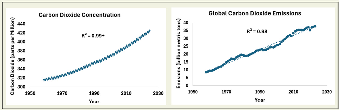
The Keeling Curve is driven in part by annual human emissions of carbon dioxide. While more variable than atmospheric concentration (and certainly a much more complex number to compile each year) the long-term trend (above right) is captured with a simple linear fit (the dashed line). So we have not deflected this trend either, although the short-term impacts of major global events, such as COVID, the bursting of economic bubbles, or the demise of the Soviet Union might be detected.
Global surface temperature anomalies since 1958 (below left) show interannual variation, but the overall accelerating trend is clear, and has been for decades.

As both carbon dioxide concentration and global average temperature show similar non-linear responses over time, the relationship between them, which our understanding of greenhouse gases would suggest should be strong, is strong indeed (above right). The relatively high interannual variation since 2020 has received considerable media attention, but does not appear to lie outside the range of variation in previous years and might be explained in part by the status of the El Niño/La Niña or ENSO system.
Carbon dioxide is certainly not the only important greenhouse gas, but is apparently a very powerful index to all the changes we are causing that drive global warming.
Other Indicators of Global Change
Methane and Nitrous Oxide
Methane and nitrous oxide are, after carbon dioxide, the most important greenhouse gases that contribute to global warming. Recurring data are available monthly from 1983 and 2001 respectively for these two gases. Methane (below left) shows some variation across years, but still exhibits a strong linear trend for the last 40 years.

With a shorter timeline, monthly nitrous oxide concentration data (above right) also show a constant rate of increase.
Both of these gases are strongly correlated with carbon dioxide (see the two figures below) as would be expected visually from the graphs above. This suggests that the processes increasing carbon dioxide concentrations also impact these other two gases proportionally. This again supports the idea that carbon dioxide is a key index to global change and global warming.

Oceans and Ice
Ice caps and oceans provide important buffers against the environmental processes forcing global change. Oceans have absorbed perhaps as much as 40% of carbon dioxide emissions to date, and as much as 90% of the heat added to the global climate system by increases in greenhouse gases. Ice caps in Greenland and Antarctica are far from equilibrium with current and projected temperatures, and their continued melting will contribute to sea level rise for centuries. Both thermal expansion as ocean water warms and melting of land-based ice are driving increases in sea level.
Loss of sea ice in the Arctic Ocean (below left) is one of the most visible indicators of a warming climate system. Each year, ice coverage reaches a minimum in late summer and satellite measurements since 1979 have documented a continuous decline in coverage at this time of year.

While loss of ice already afloat in the Arctic Ocean does not raise sea levels, loss of land-based ice in glaciers and ice caps does. Data on cumulative ice loss from the Greenland and Antarctic ice caps (above right) both show continuous rates of net loss.
Estimates of total increase in heat content of the global oceans from 1958 to the present are available for 0-700 and 0-2000 meter depths. Both show non-linear or accelerating gains over time (below left).

Melting ice caps and increases in ocean heat content would be expected to result in rising sea levels. Tidal gauge and satellite measurements of sea level since 1958 (above right), show a consistent and perhaps slightly accelerating increase.
A relationship might also be expected between combined total ice loss from Greenland and Antarctica and rising sea levels. That relationship is strong and linear.

Tropical Storm and Total Storm Energy in the North Atlantic
Warmer air and ocean temperatures should increase the frequency and intensity of tropical storms.
Storm frequency reported here is the number of storms that achieve windspeeds of 39 miles per hour or more. Accumulated Cyclone Energy (ACE) is an index to all the energy released by those storms over a complete hurricane season.
ACE for any one storm is calculated as the square of sustained wind speed for each 6 hour period summed over the lifetime of that storm and then divided by 10,000. ACE for a year is the sum of values calculated for all storms that occur in that year. The values shown below are for the North Atlantic.
The historical trends for both number of storms (below left) and total intensity (below right) are noisier than the other measures reported above, but both have basically doubled since 1958. While R2 values are lower, both trends are statistically significant.

Drivers of Climate Change
Given the consistent trends in the rest of the Earth system variables presented here, we might guess that changes in the most important drivers of these trends have changed consistently as well over the last 60+ years. Perhaps the two most fundamental indicators of human impact on the Earth are total population numbers and total economic activity.
Population, Global Economic Activity and Carbon Intensity
Human numbers have indeed shown a linear increase since 1958 (below left), although the trend would be highly non-linear over longer time spans. This recent pattern results from a linear decline in the growth rate applied to an increasing base of total population. Declining rates of increase have been seen in essentially all regions of the world, but at different rates in different places.

Growth in human numbers along with a continuous (if unequal) increase in per capita income have led to a consistent increase in global economic activity as captured in global gross domestic product (above right, GDP expressed here in constant 2015 $US).
Combining global GDP with data on global carbon dioxide emissions provides a useful measure of the carbon intensity of the global economy. Since 1958, the ~10-fold increase in real GDP has resulted in only a 4.3-fold increase in carbon dioxide emissions, suggesting that carbon intensity (above right - in billion metric tons of emissions per trillion dollars of real GDP) has been reduced by more than 50%. The trend has been remarkably consistent and linear, and does not appear to have been appreciably altered by world events. This must reflect the accumulation of technological change in the global energy system with an increasing emphasis on efficiency and low-carbon sources.
And Here We Come to the Two Hopeful Trends
Over the time frame of the data shown here (1958-2024), population increase is nearly constant but the rate of growth has been declining steadily. Projecting that decrease in population growth rate linearly into the future, the rate crosses zero around 2060, the population line bends, and global population peaks in that year at about 10 billion. If the linear decrease in carbon intensity continues, that value reaches zero around 2070, predicting a carbon neutral global economy.
The vision of a stable global population and a carbon neutral economy may set hopeful targets or guideposts, but neither is assured. There are powerful social and technological forces that could deflect either trend. Using a simple, data-driven model of global change, the predicted difference between a carbon neutral future (below left) and one in which emissions continue to increase linearly (below right) could translate to a nearly 1.5 degree Celsius difference in global average temperature by 2070. That difference would continue to increase beyond 2070.

This very simple approach allows us to frame a very simple question about our climate future: Which trends (the environmental variables like global temperature, or the social and economic variables like population growth and carbon intensity) will continue to follow the consistent patterns shown here, and which will bend?
Our climate future depends on the answer to this simple yet very complex question.
Sources
Acknowledgement: Thanks to Scott Ollinger for several helpful suggestions that have improved this data summary.
All of the graphs in this paper were created by the author using publicly available data sets or sites covered by Creative Commons copyright. This post is also covered by Creative Commons copyright CC BY-NC-SA allowing non-commercial use with attribution.
A spreadsheet with all the numbers used in these graphs is available here.
Data sources include:
Atmospheric carbon dioxide concentration:
https://scrippsco2.ucsd.edu/data/atmospheric_co2/primary_mlo_co2_record.html
Carbon dioxide emissions:
Global average surface temperature anomaly:
https://data.giss.nasa.gov/gistemp/graphs_v4/
Atmospheric methane concentration:
https://gml.noaa.gov/ccgg/trends_ch4/
Atmospheric nitrous oxide concentration:
https://gml.noaa.gov/ccgg/trends_n2o/
Arctic sea ice coverage:
https://climate.nasa.gov/vital-signs/arctic-sea-ice/?intent=121
Rate of water loss from Greenland and Antarctica:
https://climate.nasa.gov/vital-signs/ice-sheets/?intent=121
Ocean Heat Content:
Rate of sea level rise:
https://www.epa.gov/climate-indicators/climate-change-indicators-sea-level
Number of tropical storms in the North Atlantic and accumulated cyclone energy of those storms:
https://en.wikipedia.org/wiki/Accumulated_cyclone_energy
Human numbers and rate of increase:
https://en.wikipedia.org/wiki/World_population
Global GDP:
Heavily researched does not guarantee correct. Even one erroneous assumption in common renders pages of references, papers and citations useless. CAGW’s GHE contains three such assumptions.
GHE claims without it Earth becomes 33 C cooler, a 255 K, -18 C, ball of ice.
Wrong.
Naked Earth would be much like the Moon, barren, 400 K lit side, 100 K dark.
TFK_bams09 heat balance graphic uses the same 63 twice violating GAAP and calculating out of thin air a 396 BB/333 “back”/63 net GHE radiative forcing loop violating LoT 1 & 2.
Wrong.
Likewise, the ubiquitous plethora of clones.
GHE requires Earth to radiate “extra” energy as a BB.
Wrong.
A BB requires all energy leaving the system to do so by radiation. Per TFK_bams09 60% leaves by kinetic modes, i.e. conduction, convection, advection and latent rendering BB impossible.
GHE is bogus and CAGW a scam so alarmists must resort to fear mongering, lies, lawsuits, censorship and violence.